A comparison of stock market performance among countries
The performance of stock market indices varies between different countries. Market-to-market and stock-to-stock correlations tend to get high during downturns,[5] but differ considerably during other, more peaceful market environments.
MSCI, a financial market data company, offers great quality data on historical market indices of different countries. Some of the data is available through their website, although it is important to note they are the owners of this data and must consent to use of it in any meaningful way. All the usual disclaimers apply.[6]
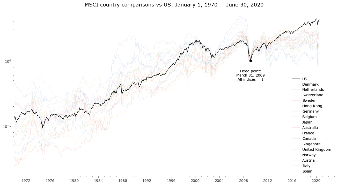
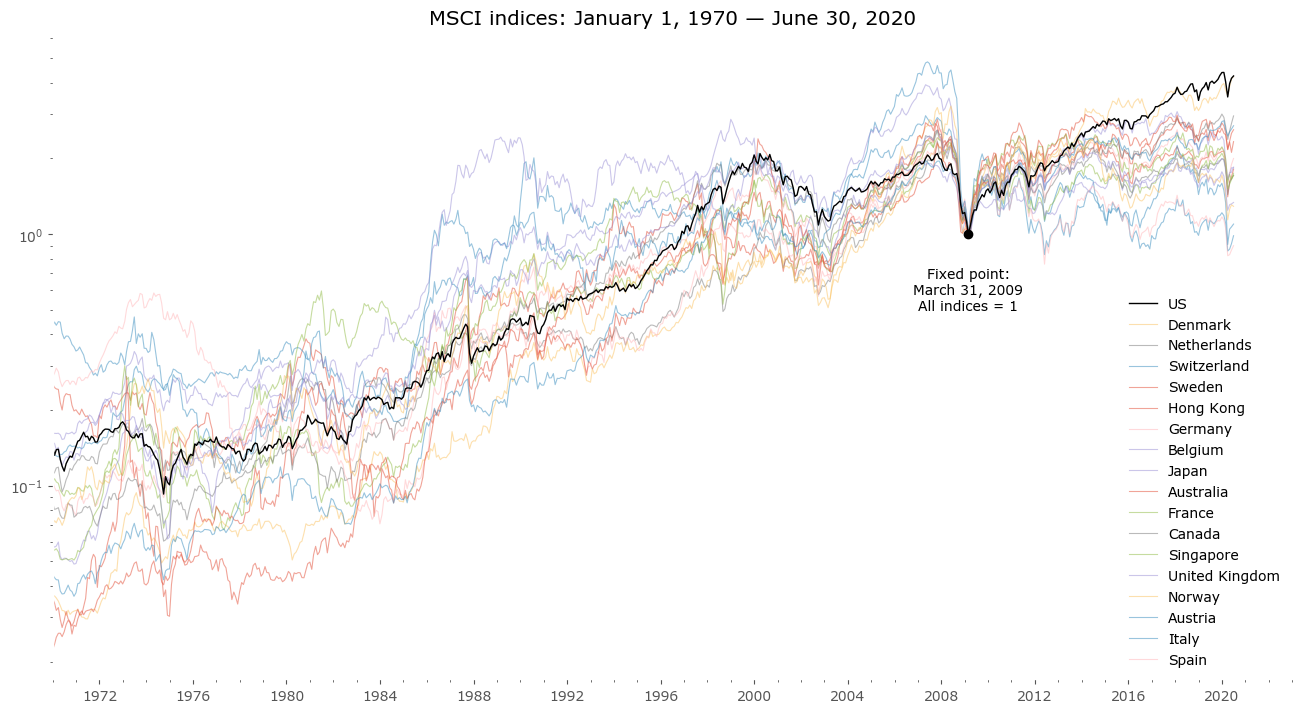
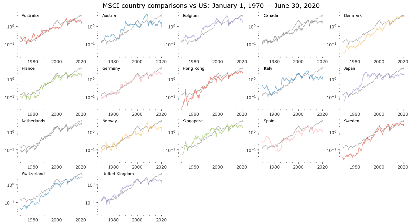
The stock market indices of select countries are shown below together on one chart. The criteria for inclusion are simple: data must be available as far back as 1970. The list of countries is sorted by performance since the climactic low of March 2009 - that moment is also the fixed point for the chart. All data is in monthly intervals (end of month data) and shown in a US Dollar basis.
The data does not include dividends nor inflation. These are price-only indices, not total return.[7] They are comparable however, as all indices have the same construction and come from the same source. More on the index calculation methodology on MSCI's methodology page.[8]
Hover over legend on chart to see specific countries highlighted.
All countries - US - Denmark - Netherlands - Switzerland - Sweden - Hong Kong - Germany - Belgium - Japan - Australia - France - Canada - Singapore - UK - Norway - Austria - Italy - Spain - Hover over legend on chart.
Country index statistics
Selected stats of the country indices are presented in Table 1. A qualitative analysis follows.
Note: here the data is sorted by total CAGR from 1970, not by return from the 2009 low.
| Country | CAGR 1970-2020 [%] |
standard deviation of monthly returns [%] |
maxDD [%] |
maxDD start date |
maxDD end date |
length of maxDD in months |
CAGR / maxDD | CAGR since March 2009 [%] |
Excess return since March 2009 [%] |
Comments |
|---|---|---|---|---|---|---|---|---|---|---|
| Denmark | 9.87 | 5.5 | -56.4 | 2008-05-30 | 2009-02-27 | 9 | 0.17 | 13.56 | 3.7 | Highest return since 1970 |
| Hong Kong | 9.64 | 9.6 | -88.9 | 1973-02-28 | 1974-12-31 | 22 | 0.11 | 7.75 | -1.9 | Highest deviation of returns |
| Sweden | 8.86 | 6.7 | -73.8 | 2000-02-29 | 2002-09-30 | 31 | 0.12 | 8.79 | -0.1 | |
| Switzerland | 8.47 | 5.1 | -49.0 | 2007-04-30 | 2009-02-27 | 22 | 0.17 | 9.14 | 0.7 | Lowest maxDD |
| Netherlands | 7.26 | 5.4 | -61.4 | 2007-10-31 | 2009-02-27 | 16 | 0.12 | 10.01 | 2.7 | |
| Japan | 7.07 | 5.9 | -65.4 | 1989-02-28 | 2003-04-30 | 170 | 0.11 | 5.49 | -1.6 | Longest drawdown (over 14 yrs) |
| Singapore | 6.99 | 8.0 | -71.5 | 1973-01-31 | 1974-12-31 | 23 | 0.10 | 4.85 | -2.1 | |
| US | 6.95 | 4.4 | -52.2 | 2007-10-31 | 2009-02-27 | 16 | 0.13 | 13.61 | 6.7 | Highest return since 2009; Lowest st. dev. of returns |
| Germany | 6.03 | 6.2 | -65.5 | 2000-02-29 | 2003-03-31 | 37 | 0.09 | 6.30 | 0.3 | |
| Norway | 5.94 | 7.7 | -69.0 | 2008-05-30 | 2009-02-27 | 9 | 0.09 | 2.27 | -3.7 | |
| France | 5.76 | 6.4 | -58.7 | 2007-10-31 | 2009-02-27 | 16 | 0.10 | 5.03 | -0.7 | |
| Canada | 5.58 | 5.6 | -57.3 | 2007-10-31 | 2009-02-27 | 16 | 0.10 | 4.87 | -0.7 | |
| Belgium | 4.95 | 5.9 | -74.5 | 2007-04-30 | 2009-02-27 | 22 | 0.07 | 5.56 | 0.6 | |
| United Kingdom | 4.44 | 6.2 | -72.1 | 1972-04-28 | 1974-11-29 | 31 | 0.06 | 2.59 | -1.9 | |
| Austria | 4.25 | 6.9 | -81.2 | 2007-05-31 | 2020-03-31 | 154 | 0.05 | 0.82 | -3.4 | |
| Australia | 3.96 | 6.9 | -65.0 | 2007-10-31 | 2009-02-27 | 16 | 0.06 | 5.37 | 1.4 | |
| Spain | 2.41 | 6.7 | -87.9 | 1974-04-30 | 1983-12-30 | 116 | 0.03 | -0.92 | -3.3 | |
| Italy | 1.65 | 7.3 | -76.1 | 1973-06-29 | 1977-12-30 | 54 | 0.02 | -0.13 | -1.8 | Lowest return since 1970 |
Countries vs US
As the US has become the largest stock market by capitalization in the world, it's interesting to compare other markets vs the US. Below is an array of all the above markets plotted vs the US stock market. As you can see, some of these had very similar price paths to the US stock market, such as the Netherlands.
The United Kingdom also followed a pretty similar path, but diverged substantially from 2014 onwards.
Others have followed a severely different path, such as Spain, which had a massive, nearly 90% drawdown from 1974 to 1984. The index of Austria, which has experienced a tiring drawdown between the years 1990 and 2002, missed the impressive 1990s rally that's been experienced worldwide.
Although stock market indices follow different paths, the general rule of rising together during bull markets (though some more, some less) and falling together during bear markets (some more, some less) results in the paths crossing each other multiple times. Such as the examples of Norway and Singapore, both experiencing wild swings of over/underperformance, but nevertheless crossing their price levels many times with the US during this 50-year period.
Japan might be the most extreme example of mean-reversion[9] - after several decades of high outperformance until 1991, the country has been in an almost 30-year consolidation phase ever since, with big swings but overall little change of the index level after this time.
Click any chart to enlarge. Click again to go back to array.
Conclusions
When it comes to explaining the differences, one differentiating factor may be economical and/or political differences between countries.
More important in my view are sector differences. After all, different bull markets have different sector themes, such as the dot-com of the late 1990s (technology), or the emerging markets bull market of 2003-2007 (industrial, materials and commodities). Countrywide indexes vary considerably by their sector weightings. That is a topic for additional study.
Overall it's rational to assume the current US outperformance (seen easily as the US has the highest return since March 2009) will run into a stumble in the future. It's impossible to say when that will happen. But provided these charts, a geographically diversified portfolio seems a rational alternative to investing all of one's portfolio into just one specific country's stock market index (through an ETF for example).
It's important for an investor to be conscious not only of the type of assets one owns (stocks or bonds, or real estate, real or virtual, etc.), but also the country of domicile or the sector makeup of one's portfolio. Even if it's tempting to put most of your eggs in a (currently hot and desirable) basket, it's important to be realistic about the long-term perspectives of such a basket and understanding how painful that trade might end up being. What size of drawdowns and draw-ups are historically possible and probable, how large drawbacks can be expected. Even multiyear bull and bear market trends end eventually.
Below you can see all the country comparisons on one chart, change the view just by hovering over different country names.
Hover over legend to see specific countries vs US highlighted.