Data Visualization - the Momentum Map
Dealing with multidimensional data in data visualization is tricky. You have to strike a balance between presenting a lot of useful information, but not cluttering charts too much. There are a lot of flashy and glimmery chart options. Yet it's easy to lose your audience by flooding them with too much information.
In statistics, an analog is in multivariate variables. People come up with techniques such as PCA (Principal Component Analysis), Factor analysis (hence the popular "Momentum", "Growth", "Value" and other stock market factors), Cross-correlation analysis, and many, many more.[1] This too is a form of balancing insights from highly multidimensional data into more actionable, lower-dimensional outputs, that help humans understand data and act upon them. For example, in the financial markets: buy or sell, how much and at what price. Even now, in the midst of an AI, "deep-learning" revolution, dealing with multiple dimensions of all kinds of data is important and will continue to be so, as long as there is more data.
All this looks hard at first, but oftentimes just visualizing some well known data a bit differently, sometimes opens up new avenues of understanding. Ones that would be a lot harder or even impossible to explore without the insight from the right data visualization. This relates a little bit to what I've touched upon in my Arxiv Art project years ago. Great science teams are able to come up with understandable explanations of complex phenomena. Sometimes the best insight comes from thoughtfully and beautifully crafted graphics.
I've recently kicked off a tools section. I hope to populate it with some useful data visualizations, and to amass a (small) portfolio of such tools, helping me (and, hopefully, you who reads this) to understand the stock market or other financial markets a little bit better.
The first of such tools is what I call the Momentum Map.
It is a simple visualizer of the momentum[2] of a series of financial assets (I've chosen the main sectors of the United States stock market) between two time scales: a longer one (1-year), and a shorter period (1-month). It's not that important what the specific momentum measures are -- as I've shown in the article about indicators -- as they are fairly similar over the long term, especially when you set their parameters appropriately. It can be a 52-week high-low measure. It can be RSI or Rate of Change. It can be a distance from the rolling (moving) average price. It will all work similarly.
There's also not anything magical about choosing 1 year and 1 month. It could be 250 and 20 days. It could be 5 years and 1 year. Every scale will have it's characterstics. What's important is, in my view, that it needs to be two separate scales, usually used in stock market analysis, and that is sufficient. For me, from my experience, 1 year and 1 month is ok.
Figure 1 below presents a typical layout of the sector map for a given date (here just randomly chosen to be August 27, 2018). Three sectors - Healthcare, Consumer Discretionary and Technology - where on their 52-week high that day. The worst performing Consumer Staples sector was somewhere close to 60% of it's recent year price range (the horizontal axis). Yet most of the sectors (besides healthcare) where in a similar place in the short-term (vertical axis) time scale.
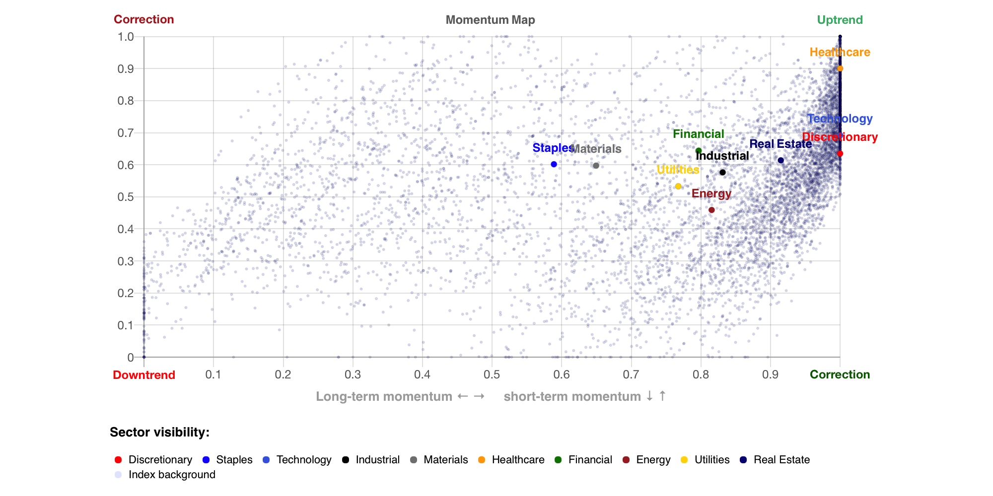
Fig. 1: Momentum map of main US sectors (shown in different colors) vs a background of 2D momentum of the market index form 1994 to 2025 (light blue points). The horizontal axis is 1-year momentum, the vertical axis is 1-month momentum.
I've created this tool to effortlessly skim through the sector space over longer time periods. The main feature of the map is the slider, with which you can set any date for most of the time official sector price data is available, and just compare how similar periods performed. Also you can zoom in and out on that preffered time period.
Every bull market and every bear market has it's own flavor. In most of these cycles, the so-called "cyclical" sectors - Discretionary, Tech, sometimes Financial and Energy - are known to lead, while the "defensive" sectors - Staples, Utilities, sometimes Healthcare - fare a bit better during downturns. Apart from this, every bull and bear market has it's main theme, for example the 2000-03 rout was one primarly of the Tech sector, on the other hand the after-covid era was primarly driven by gains in Tech, Communications and Discretionary.
None of this gives you complete recipies for what to do in the current market, or what sectors will be outperforming in the near-future. But it can give you some hints.
For example, market sectors are much more likely to stay "overbought" (the top-right) area of the chart than "oversold" (the bottom-left). This is well seen in the density of the background points, which are momentum values of the main market index. Nonetheless some extreme overbought conditions, like in the January 2018 melt-up scenario, or just before the Covid crash of 2020, can be useful warning signs of overall overheating.
A list of features and how to use them is given on the instructions section of the map. I hope it's clear and easy to understand, and I hope to update the tool in the future - for example with additional subsectors, or adding just simply implementing data updates. As it is now, there are no guarantees of the tools' correctness or that it will be updated - it is just a side project of mine, and I intend to update it only if time permits. Please use it responsibly and be advised of the disclaimer at the bottom of this page - these rules also apply to the use of the Momentum Map. Use it at your own risk.
As a side note, all of the data visualization is done in HTML and JavaScript (mainly based on the open-source project Chart.js).[3] All the calucaltions are done on the client side, so it might take a bit (1-3 sec) to load at startup, the sliding between dates (especially on "hover") might be a bit heavy. It's a work in progress, I hope to optimize it. I've used Chart.js 2.9.4, so a fairly dated version, but an update to the latest version is possible and quite easy, but would require some additional work. As for me, the features of 2.9.4 where enough for my needs.
How to read the Momentum Map
Figure 2 outlines the basic instinct of how to understand the map. As stated earlier, most of the time (a rising market) the main index and the sectors stay overbought. That is the top-right sector of the chart. In general the right-hand area represents bull markets (rising prices of stocks), and left-hand are represents bear markets (fallinf prices). The higher density points areas show quite clearly where a "short-term" volatility between these two market regimes lives. I've annotated them manually to emphasize what is a normal market behavior.
In falling (bear) markets, the sectors usually fluctuate in the red circled area. In rising (bull) markets, most sectors occupy the green space. The most interesting things happen in the "in-between" area - that is, this the time when trends change and it's hard to capture those areas clearly. It's also a kind of holy grail of most trading systems - i.e. knowing when to switch from "defensive" to "offensive" mode in the stock market is a quite similar question as to "how to time the market correctly". I do not claim to know how to, are that this tool settles the issue, I just hope it can give some insight into the ongoing inquiry.
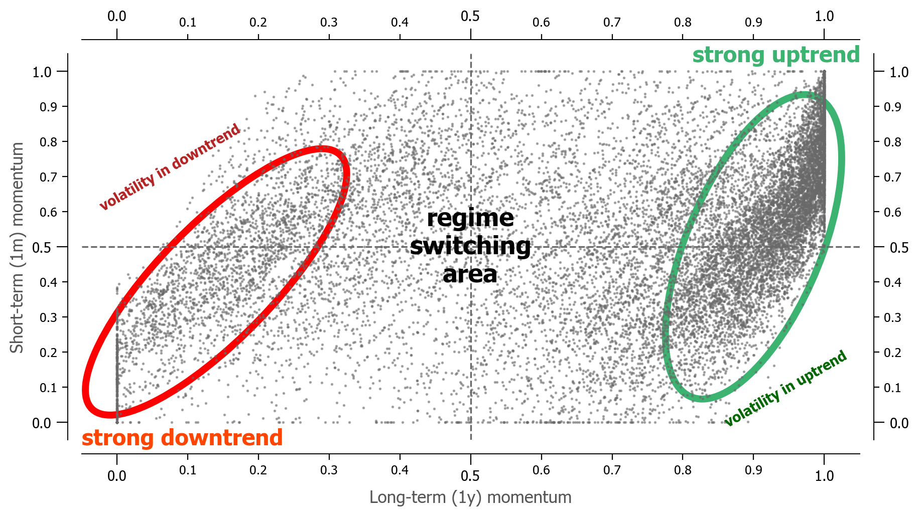
Fig. 2: Momentum map with background of 2D momentum of the market index form 1956 to 2025 (grey points). The horizontal axis is 1-year momentum, the vertical axis is 1-month momentum. Adnotations indicate how to read the chart.
Finally, figure 3 represents the S&P500 index, backfilled to 1956, with coloring according to different Momentum Map regimes. One can clearly see the bull / bear market regimes. One might be tempted to form a market timing strategy based solely on these values -- I caution you nonetheless, that zooming on the specific dates reveals a considerate ammount of flickering between market states, which would result in non-negligible trading costs. Additional filters, as present in the Global Growth Cycle, Growth Trend Timing or other similar momentum strategies should be considered.
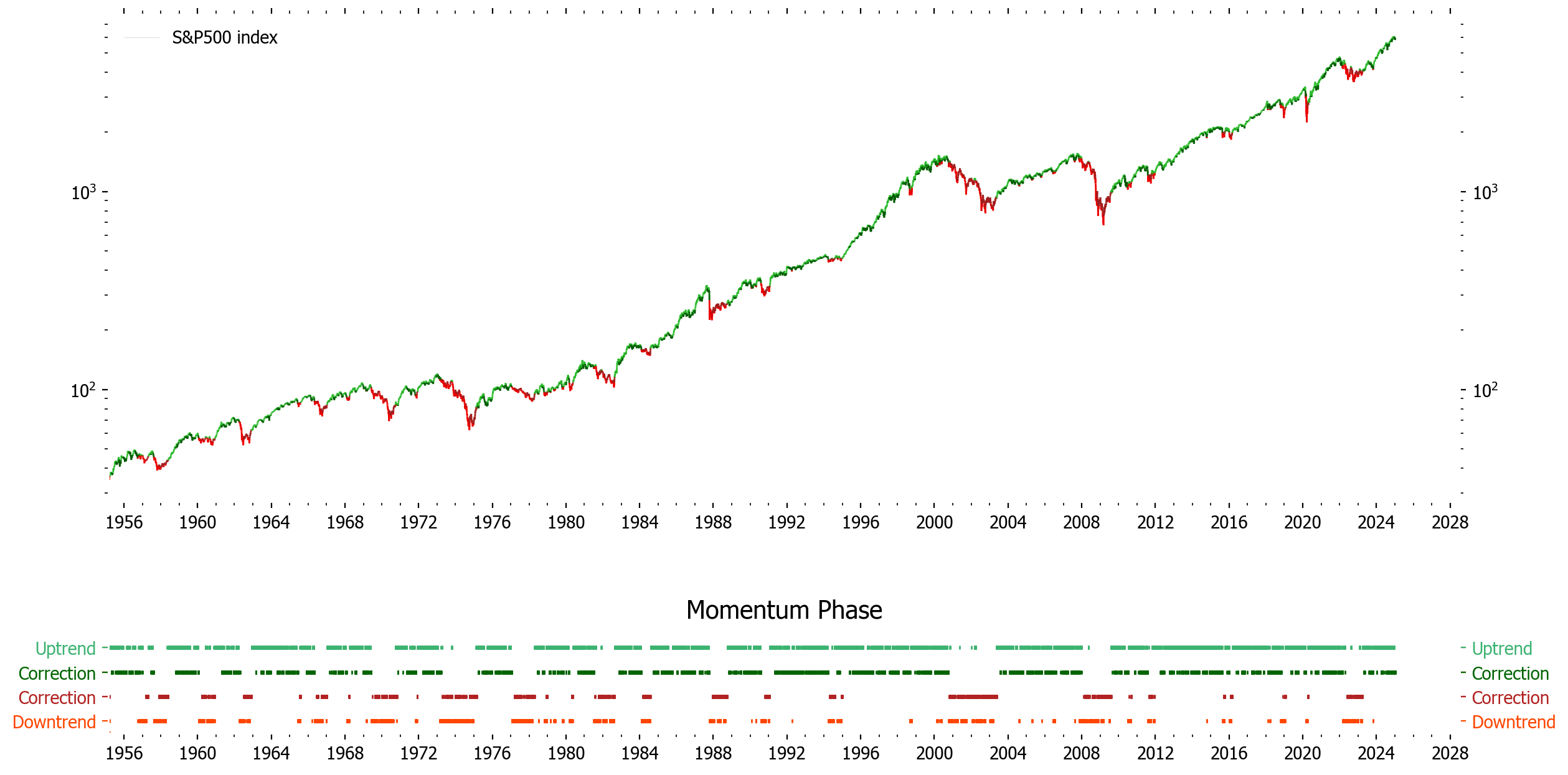
Fig. 3: S&P500 index filtered by momentum regimes, according to the Momentum Map. Red indicates bear market episodes (falling prices), green bull markets (rising prices). Darker regions indicate corrections in corresponding regime.
Further Discussion
If you have any comments or suggestions regarding the Momentum Map, feel free to contact me via linkedin. You can find the link in the about section.