Global Growth Cycle
Identifying Economic Turning Points, a Market Timing Strategy
Table of contents: OECD CLI, Diffusion Index, Filtering the signals, A typical expansion cycle, Global Growth Cycle model, Global Growth Cycle strategy, Global results, Discussion, References
Fluctuations of economic growth are observed throughout multiple measures of business activity and among countries. Due to their synchronized manner, they are often referred to as business cycles.[1]
The problem with this designation is a lack of strict periodicity – as we'll see below, the cycle lengths can vary from 1.5 years to over 4 years, with no clear mechanism causing this variation. The variations seem random, leading some economists to disagree with using the term cycle. Others carry on with trying to form very strict periodicity limits, even distinguishing between cycles of varying time frames (Kitchin, Juglar, Kuznetz, Kondratiev cycles) and trying to fit them together to real data with near-mathematical rigor.
In real life, even physical phenomena that are clearly periodic, experience cycles of varying length. An example of this are solar cycles – with a periodicity of around 11 years, the individual cycle lengths span from 9 to 14 years during 400 years of historical observations.[14] For this reason, serious effort is being taken in order to correctly predict the length and amplitude of the most recent cycle, as these parameters relate to the amount and severity of solar storms that we might experience on Earth. Other examples of clear, though not perfectly regular physical cyclicality, include Earth's climate periodicity (glacial and interglacial cycles)[15] and periodic orbital changes involving Milankovitch cycles.[16] It makes sense that economic or biological systems, which are far more complex than physical ones, also experience variability in their quasi-regular fluctuations.
Business cycles are therefore a topic of interesting, extensive economical research. Some of the first comprehensive studies were done by Burns and Mitchell (1946)[1], Mintz (1969, 1972)[2][3], although the topic has been analyzed as far back as the 19th century (see: Dimand, 2015, "Macroeconomics, History of up to 1933")[12]. Since then economic institutes dedicated substantial research to the matter[6][7], such as the U.S. National Bureau of Economic Research (NBER)[4][5], which is responsible for the dating of recession periods of the U.S. economy.[22]
A modern approach is the use of Leading Indicators. Several institutes compile multiple known economic time series data into 3 sets: leading, coincident and lagging indicators.[17] These should, in theory, correspond to the economic growth cycle – expansion and contraction periods (as measured for example by GDP growth rates, or changes in industrial production) – in a specific way, from lead to lag. These indicators are usually compiled, and a procedure of finding turning points in the resulting Composite Leading Indicators is performed. This allows to identify peaks, throughs, and expansion and contraction phases.[8][9]
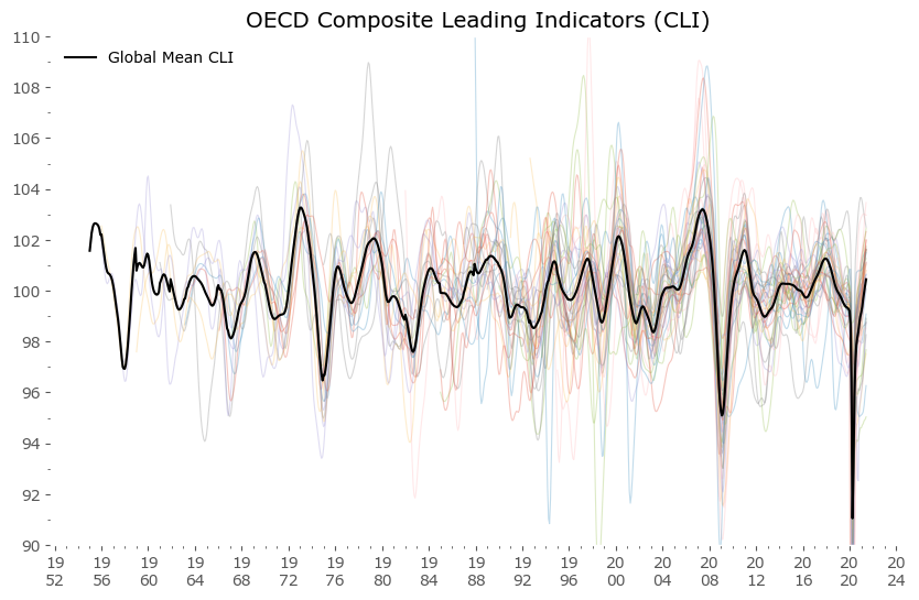
Our approach here will utilize the publicly available OECD Composite Leading Indicators (CLI) data for most member countries + additional data for large economies outside of the OECD.[11] The full list, along with the economic and financial time series making up the CLI for each country, is available here.[23] The data is available for download on the dedicated OECD data page.[24] This data is visualized in Figure 1 below.
Hover over legend on chart to see specific countries highlighted.
Diffusion Index
From the data above we can see that individual countries' leading indicators behave in a similar manner. Hence the composite Global Mean is usually a good proxy for each country's CLI value. It would even be a good study to check if individual countries' deviations are a good indication of future relative weakness or strength. You can also note that we seem to be currently – after the coronavirus pandemic low – in a global synchronized growth period.
The next step will be calculating a Diffusion Index (DI) of the data presented above, which measures how much the component series move in sync together. This approach is known in economic research, a recent such example can be found in Zhao (2020).[13] A similar statistical method, most commonly used in econometrics, is called a dynamic factor model,[18] where the movements of a large group of time series are attempted to be explained by a smaller number of underlying factors.
I'll be following the simple methodology explained plainly by the excellent source of practical market analysis: SentimenTrader. Here's a link to their article detailing further calculations.[19]
We start by taking the month over month changes in each CLI series, and then calculate the percentage of countries for which the CLI is rising. A resulting plot is shown in green in Figure 2. below. I've also included the original Global Mean of CLI values (in black) to underline a key characteristic: that turning points of the Mean are most often associated with the crossing of the Diffusion Index through 0.5. This in general didn't have to be the case – if global growth was less synchronized for example, the mean could sway a long way from the percentage of rising and falling country CLIs. Fortunately, this is not the case.
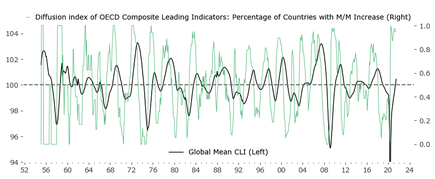
Another key characteristic of the Diffusion Index is the clearly cyclical nature. If economic growth among countries would be more random (less global and more idiosyncratic), the Mean Global CLI would be closer to a linear function with smaller fluctuations. The Diffusion Index in turn would be far less cyclical. The existence of this stronger global correlation of economic expansions and contractions forms the basis of the (more or less regular) business and market cycle.
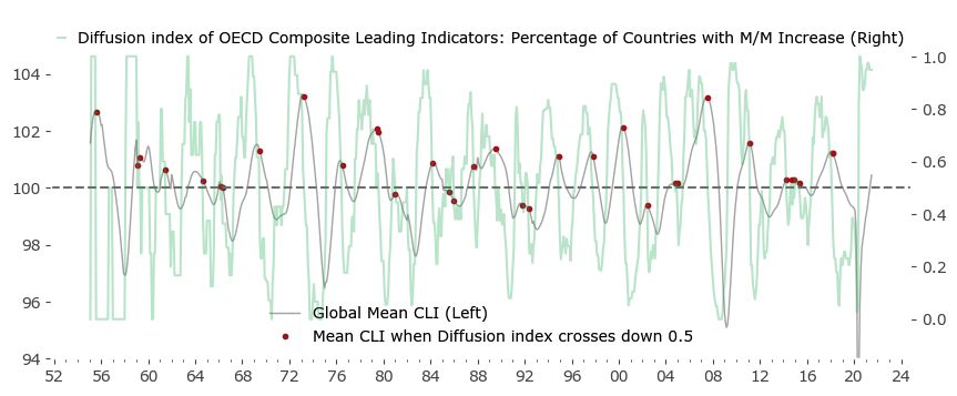
Let's call the rising phase of the Global Mean a Global Growth Expansion (GGE). Fig. 3 below highlights the specific moments (red), when the Diffusion index crosses from above 0.5 to below that value. Due to the GGE effect, the points are pretty close to the Mean's local maxima. There are some false signals and some redundancy (a set of signals in close proximity), but in general it's a pretty good approximations of local maxima.
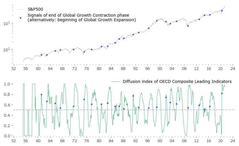
The symmetric case of the Diffusion Index crossing above 0.5 also correlates well with extreme points – this time local minima of the Mean CLI. After a period of what can be called a Global Growth Contraction (GGC), the Mean often rises sharply. These points in time are shown in blue in Figure 4.
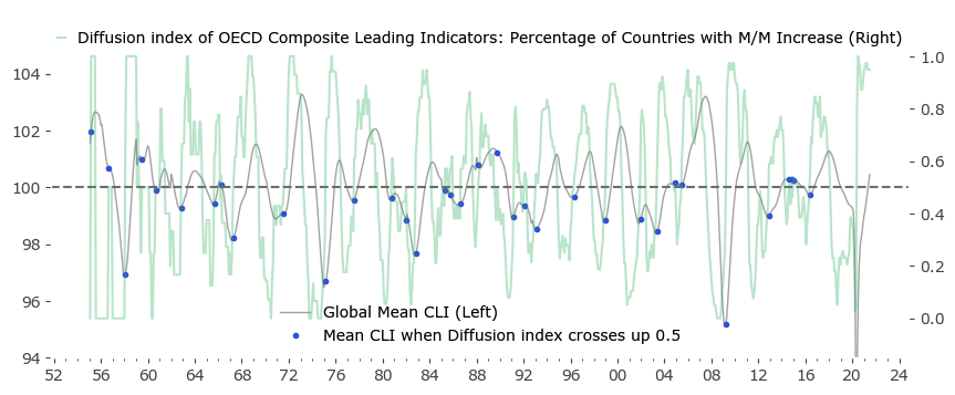
Most importantly, the above method captures all of the local extremes of the mean CLI, although some additional false signals are also present. The logical next step would be to introduce some kind of filtering to these set of signals.
Dean Christians from SentimenTrader in the article mentioned above[19] uses a clever filter: first he looks at points of diffusion count above 85% (first cutoff parameter), which means counting the total number of months during the previous 18 months (1.5 years, second parameter) when the Diffusion Index was above 85%. Then he looks specifically at points when this composite measure crosses from above 10 months (a third cutoff parameter) to 0, selecting only the first such instances in more than a year. This algorithm leaves him with 6 historical signals, four of which preceded considerable slowdown periods for the S&P500 index.
Filtering the signals
Let's consider a similar approach – but one guided more by the Bry and Boschan Algorithm[4] (BBA) often used in Leading Indicator turning points detection. An informative work on this and other algorithms utilized in this area is a working paper study from Eurostats' Mazzi and Scocco (2003).[10]
Accordingly we will look at diffusion counts above 50% (as the charts above suggest) and also leave the 18-month lookback period. But instead we'll filter out only global expansions longer than 5 months (cutoff from BBA) to not leave too many signals out. We will be filtering out repeated signals during a 15-month period from the first signal (to achieve the minimum cycle length suggested by BBA). In the BBA the last repeated signal is used for cycle turning point selection, but for the sake of practicality, we will be using the first such signal that occurred – in order to avoid a situation, where a trading signal suggests a sell order, but then resuggests one months later, without a buy signal in between.
For clarity, here is the (pseudo)code of our filtering algorithm. Key parameters are highlighted in blue.
        # Python 3.7 Code

        #

        # Assume 'ALLDATA' is a pandas DataFrame containing all countries' CLI values as separate columns,

        # dates are used as index rows (end of business month frequency)

        #

        # ALLDATA['total'] contains amount of total time series for each date.

        #

        # 'countries' is a list of names of all available countries in OECD data.

        # ----------------------------------


        # calculate the Diffusion Index (M/M Increase percentage)

        ALLDATA['diffusion_index'] = 0

        for c in countries:

            ALLDATA.loc[ALLDATA[c].diff()>0., 'diffusion_index'] += 1
        ALLDATA['diffusion_index'] = 1.*ALLDATA['diffusion_index']/ALLDATA['total']


        # calculate count of months when diffusion_index is above 0.50

        # save to 'CC50' column

        # lookback period is 18 months

        # perform lookback only during months when Diffusion Index above 0.5

        ALLDATA['CC50'] = 0

        for i in xrange(18):

            ALLDATA.loc[(ALLDATA['diffusion_index']>=0.5) & (ALLDATA['diffusion_index'].shift(i)>=0.5), 'CC50'] += 1


        # find specific dates

        # when expansions lasted at least 5 months and ended

        # (so currently CC50 = 0, but previously CC50 >= 5).

        # save them to a DataFrame named SIGNALS

        SIGNALS = ALLDATA.loc[(ALLDATA['CC50']==0) & (ALLDATA['CC50'].shift(1)>=5)]


        # ----------------------------------

        # Filtering of redundant signals:

        # ----------------------------------

        # as per Bry & Boschan Algorithm (1971), 15 month blackout after selected signal;

        # forward blackout instead of backwards

        # will be using loop because result is path-dependent

        # ----------------------------------


        # 'to_keep' will be a container for masking of signals, setting first value to 'True'

        # 'last_kept_date' will be temporary variable holding the last signal date to include in final list

        SIGNALS.ix[:,'to_keep'] = False

        SIGNALS.ix[0,'to_keep'] = True

        last_kept_date = SIGNALS.index[0]


        for i in SIGNALS.index:

            if (i - last_kept_date).days > 365*15/12.:

                last_kept_date = i

                SIGNALS.loc[i, 'to_keep'] = True

                continue


        SIGNALS = SIGNALS.loc[SIGNALS['to_keep']==True]


        # remove points before 1959, as the data from the first years is too sparse to take signals seriously

        SIGNALS = SIGNALS['1959':]
Let's look at the resulting signals – there are 23 of them. The list is given below. For comparison, Figure 5 is a representation of these signals vs the S&P500 index.
Please take note, that from here on I'll be using the price-only version of the S&P500 index. A real market strategy would preferably involve reinvestment of dividends (resulting in around 2-3% higher returns). I also disregard inflation (which historically has been at around 3% for the last century of data). These two effects (dividends and inflation) partly even each other out. The data frequency is daily.
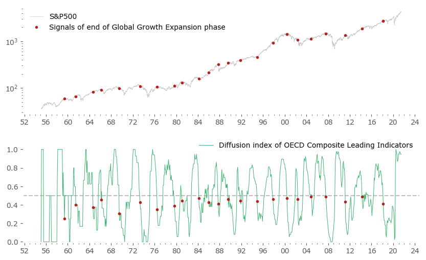
Quite a promising result. The red turning points sometimes missed the target of "catching the local maxima of the S&P500 index", but sometimes they were spot on: 1973, 2000 and 2007 market peaks being such examples.
Not to clutter the chart to much, let's look separately at a symmetrically obtained set of points for the upturn of the growth cycle, Figure 6. There are 24 of them. Some happened quite early during the consecutive expansion (2009, 2016, 2020), but a fair amount missed a substantial part of the upturn (1970/71 period). This is an indication that symmetrically waiting for the upturn might be too long for a market strategy rivaling a passive Buy & Hold approach.
| signal date | type of signal: GGE for "end of Global Growth Expansion phase" GGC for "end of Global Growth Contraction phase" |
no. of months between previous signal (~cycle length) |
||
|---|---|---|---|---|
| 1959-05-29 | GGE | - | ||
| 1961-01-31 | GGC | - | ||
| 1961-06-30 | GGE | 25 | ||
| 1962-11-30 | GGC | 22 | ||
| 1964-08-31 | GGE | 38 | ||
| 1965-08-31 | GGC | 33 | ||
| 1966-02-28 | GGE | 18 | ||
| 1967-04-28 | GGC | 20 | ||
| 1969-06-30 | GGE | 40 | ||
| 1971-08-31 | GGC | 52 | ||
| 1973-04-30 | GGE | 46 | ||
| 1975-02-28 | GGC | 42 | ||
| 1976-06-30 | GGE | 38 | ||
| 1977-07-29 | GGC | 29 | ||
| 1979-08-31 | GGE | 38 | ||
| 1980-10-31 | GGC | 39 | ||
| 1981-01-30 | GGE | 17 | ||
| 1982-10-29 | GGC | 24 | ||
| 1984-02-29 | GGE | 37 | ||
| 1985-04-30 | GGC | 30 | ||
| 1985-12-31 | GGE | 22 | ||
| 1986-08-29 | GGC | 16 | ||
| 1987-09-30 | GGE | 21 | ||
| 1988-02-29 | GGC | 18 | ||
| 1989-07-31 | GGE | 22 | ||
| 1991-03-29 | GGC | 37 | ||
| 1991-10-31 | GGE | 27 | ||
| 1993-01-29 | GGC | 22 | ||
| 1994-11-30 | GGE | 37 | ||
| 1996-04-30 | GGC | 39 | ||
| 1997-10-31 | GGE | 35 | ||
| 1998-12-31 | GGC | 32 | ||
| 2000-05-31 | GGE | 31 | ||
| 2001-12-31 | GGC | 36 | ||
| 2002-05-31 | GGE | 24 | ||
| 2003-05-30 | GGC | 17 | ||
| 2004-10-29 | GGE | 29 | ||
| 2005-06-30 | GGC | 25 | ||
| 2007-07-31 | GGE | 33 | ||
| 2009-03-31 | GGC | 45 | ||
| 2011-02-28 | GGE | 43 | ||
| 2012-11-30 | GGC | 44 | ||
| 2014-03-31 | GGE | 37 | ||
| 2014-08-29 | GGC | 21 | ||
| 2016-05-31 | GGC | 21 | ||
| 2018-02-28 | GGE | 47 | ||
| 2020-05-29 | GGC | 48 | ||
| Mean no. of months (cycle length): | 32.04 | 30.96 | ||
| In years: | 2.67 | 2.58 | ||
A typical expansion cycle
As can be seen from the signal list in Tab. 1 above, almost all signals are alternating, with one exception of 2014 and 2016 successive 'end of GGC' signals without a 'end of GGE' in between. The mean cycle length is between 2.58 years ('end of GGC' signals) and 2.67 years ('end of GGE' signals) – around 31 or 32 months, although the variability is large: the standard deviation is 9.9 months, the shortest of recorded "cycles" is 16 months, and the longest is 52 months. There is a small difference between GGE (less volatile) and GGC (more volatile) signals, but if we sum them up together we arrive at an average length of: 31.5 ± 9.9 months.
The current (latest data available at time of writing for end of June 2021) cycle is exactly 40 months from the previous 'end of GGE' signal – within the limits of one standard deviation from the mean, but historically already on the longer side.
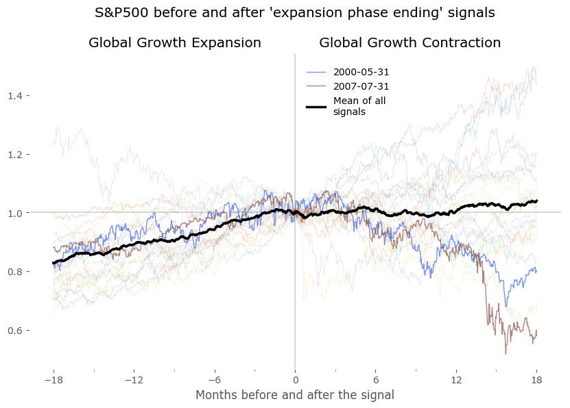
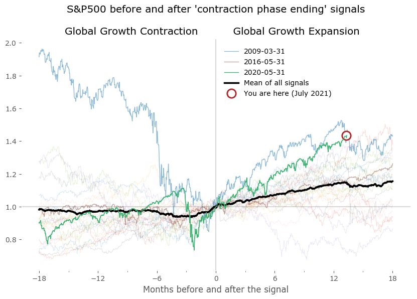
We can now plot the DI centered on these points to look for similarities between expansion and contraction periods. Do they really occur at a similar market environment? Figure 7 shows the results of all signals grouped together – normalized to the day of occurrence of the signal. The blue and red signal points are all centered on 0 of the horizontal axis (the number of months before and after the signal). All signals are set to the last business day of the month. Data for DI is monthly, data for the S&P500 is daily. Selected signals are shown in bold to highlight a "typical" expansion-contraction cycle:
- signals from May 2000 and July 2007 in case of 'Global Growth Expansion ending' signals, and
- from March 2009, May 2016 and May 2020 in case of 'Global Groth Contraction ending' signals.
Beside these examples I've also included a 'Mean of all signals' in black, to provide a reference. It is clear from these plots that there is a tendency for the DI to fluctuate in a cyclical manner, before and after the signal points. This 'mean' is a rugged approach at quantifying the growth cycle, as expansions (and contractions) are usually not of the same duration – some short, some much longer – therefore the average taken by successive points in time is just a very crude approximation of a "typical cycle". Yet it is fairly accurate at least as a reference for the select signals shown in bold.
From the lower plots we see the S&P500 index usually rises in the timeframe of 12-18 months before the "expansion phase ending" signal and is mostly flat for a year after that. A symmetric situation is seen for the "expansion phase starting" signal on the right – although is is clear that a sharp rise of the index precedes the signals: the mean starts to rise about 3-5 months before these signals.
I've also included a "You are here" marker to signal the current situation according to the latest data. We are currently (as of July 2021) in the Growth Expansion phase. The reading end at 13, so with the count starting at 0, this means 14 months of DI staying above 0.5. It is among the longest such expansions to date.
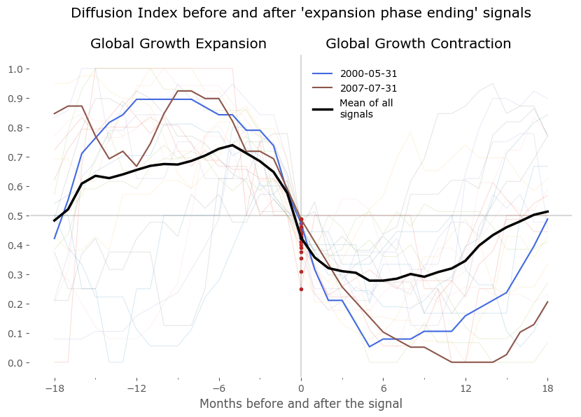
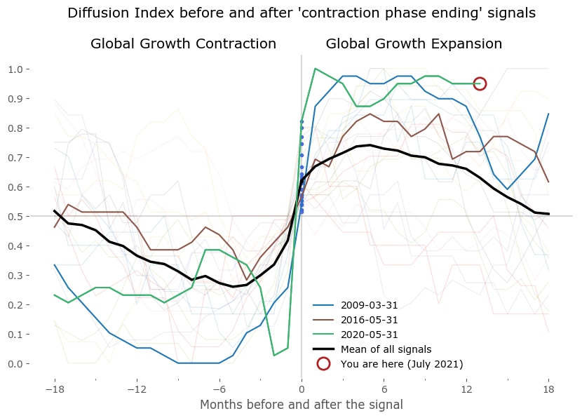
S&P500 index pre and post "end of GGE" signals (left) and "end of GGC" signals (right)
Global Growth Cycle model
Finally, we arrive at the moment when we can put all of this analysis to good use. Let's see if we can use what we've learned to build a systematic market strategy.
Let's first take a step back. Since not all of the red points have a corresponding blue point in the cycle, we would need to figure out a way of getting back into the market after a red signal. A sophisticated method (i.e. a time filter or a set of rules involving other market data) is possible. We could also torture the data in order to achieve a fully symmetric signal list (an easy target would be tweaking the lengths of the "minimum cycle length" from the Bry & Boschan Algorithm).
But let's take a much simpler approach: let us be long whenever the Diffusion Index is above 0.5 and short otherwise. Note we are getting rid of the filtering (min. 5 month expansion + min. 15 months per cycle) in order to keep the strategy as simple as possible. The algorithm here is:
Stay long whenever DI ≥ 0.5,

Stay out of the market when DI < 0.5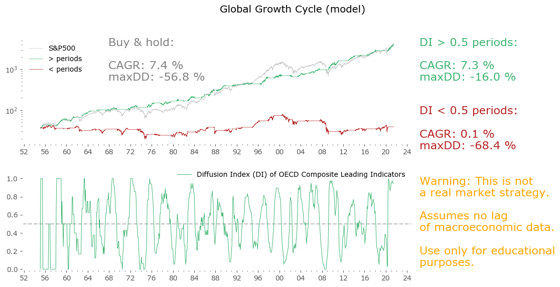
Great! – you might think to yourself. A simple strategy with almost all the CAGR of the S&P500, at less than a third of the drawdown. Well – not so fast. The catch here is that CLI data is not reported instantly. The time lag between the target date (for which a value is calculated, i.e. end of previous month) and it's publication is somewhere between 9 and 14 days. Please look at the References section below to see the current publication calendar.[25]
That's not the biggest of our problems. Even worse is that CLI, like any macroeconomic data (or any series dependent on them) is open to revision. This means even 2 – 3 months after the first publication, the data gets revised backwards.
To address the first issue is quite easy: we can just shift the datapoints 15 days forward as starting points for our strategy. After all, the index data we are using is of daily frequency. That means: assume the first day we can act upon the new data is 15 days after their assigned historical dates. Sometimes this is too pessimistic (the lags between the assigned date and release date can be shorter), but it generally solves the first problem.
The second problem is harder, as previous "unrevised" data is not available. For future use one can use only first-reported data, but there is no way to backtest such a procedure sufficiently. Fortunately, there is some indication that at least for some macroeconomic data, the historical revisions even out in a long-enough period. Please take a look at Philosophical Economics' analysis regarding the same problem with, among others, Industrial Production data.[20]
So, let us optimistically assume the second problem gets "evened out in time" (since we have no way of resolving it otherwise), and look at the results for a 15-day shifted model in Figure 9.
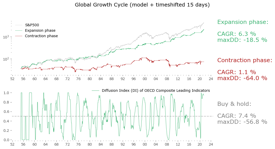
Not as great, but still very good. The CAGR went down, though not too much, and the drawdown is still very low for a long-term stock market strategy. Actually in risk-adjusted terms (CAGR / maxDD) this is still a lot better than a passive Buy & hold. With the caveats listed above (no unrevised data available), this is truly a close-enough approximation of what could be achieved, have we been trading the strategy since the earliest available data.
But wait, there is one more problem: the OECD may publish CLIs today, but they certainly did not do it as systematically since 1952. First of all, when a new member state gets added, the CLI for that country begin to appear, and are also given retroactively. For example Colombia was recently added to the OECD, but a historical series of their CLI is now available as far back as 2001. Of course, this might not be a big issue as many of the OECD member states have been included since the organization's founding. But still, such additions are another source of problems with backtested data that one should take note of.
Moreover, the leading indicator methodology also gets revised, albeit much less often that the economic data itself. At least one such big revision took place around 2002.[11] I assume the data series available to download today also incorporates this change retroactively (so is even more revised than the usual economic data revisions).
Therefore one must remember – this is not a holy grail strategy. There are a lot of issues with backtested data. Nonetheless it could be a useful allocation tool going forward. Now let's see how we can tweak it a little bit.
Global Growth Cycle strategy – a tool for actively managed stock market allocation
As we've discussed in the analysis of the typical expansion cycle, the S&P500 index usually rises some months ahead of a "end of the Global Growth Contraction phase" signal. Also, the averaged behavior during the Global Growth Contraction phase is not a decline – it is staying mostly flat. Sometimes of course the index fell sharply during these periods, especially when accompanied by recessions. But other times – most notably after the signal near the end of 1994 – it just creeped on higher. These observations will form the basis of our tweak to the simple model described above.
Once again referring to the excellent work of Philosophical Economics, let's make use of their "Growth-Trend Timing" approach.[21] Let's modify the above (15-day shifted) model with a simple hack: stay long whenever the Diffusion Index signalized Global Expansion (DI > 0.5), but let's not automatically sell during the opposite phase. Let's just use a simple moving average strategy. So:
Stay long whenever DI ≥ 0.5,

Switch to a market timing procedure when DI < 0.5
For more on the motivation behind this, please go the great, in-depth (but also very long) article about GTT on Philosophical Economics.
I'll refer to this resulting strategy as the Global Growth Cycle strategy. The market timing factor used during contraction phases is a simple 50-day moving average.
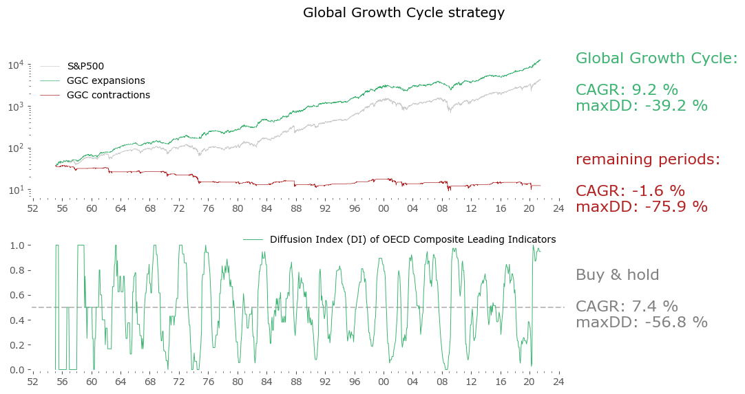
Well, market timing leads to a sizable increase in the CAGR, but an even bigger increase in maximum drawdown. In fact, the risk-adjusted return goes down. Nevertheless, it is a promising result. A "market-timing only" strategy (not shown here), employing only the 50-day moving average on price, with no input from CLIs, would yield 6.1% CAGR with the same drawdown of 39%, so one could say using the Leading Indicator data improves the "basic" result by 3% yearly without additional drawdown. If one is interested in a more conservative approach, the "15-day shifted model" version from Figure 9 offers a better risk-adjusted return, although at a cost of a lower return overall.
Global results
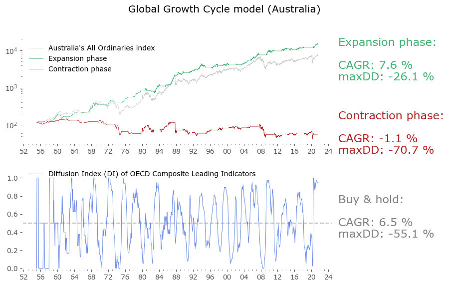
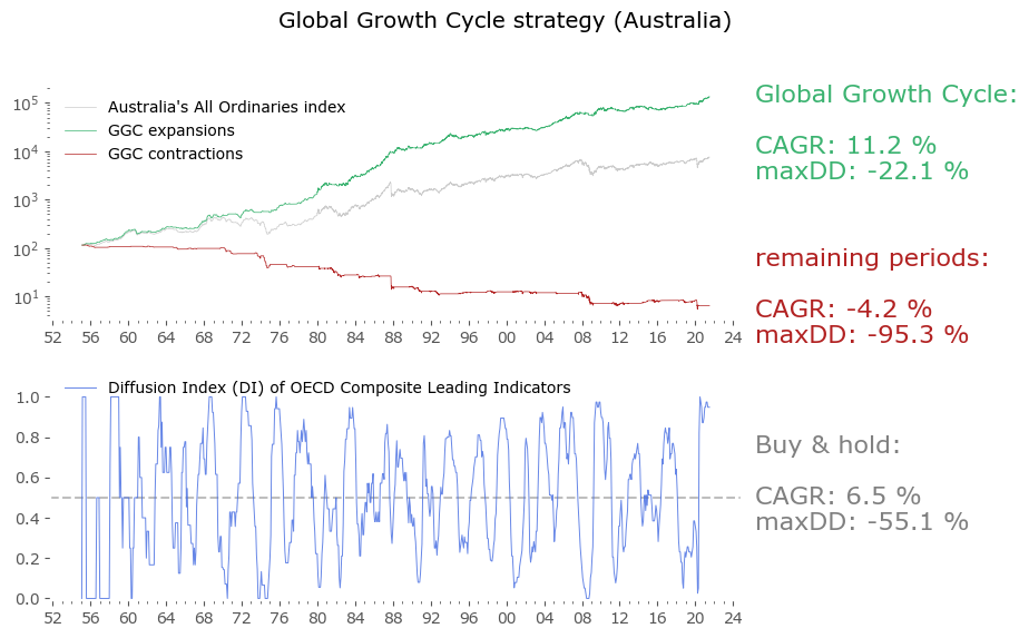
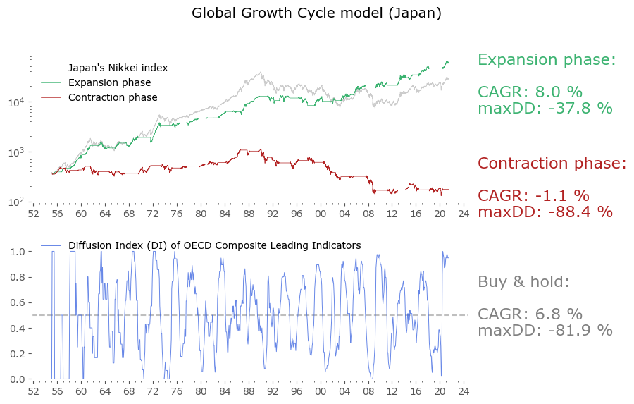
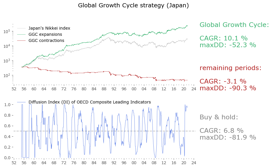
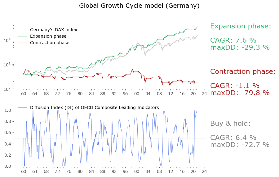
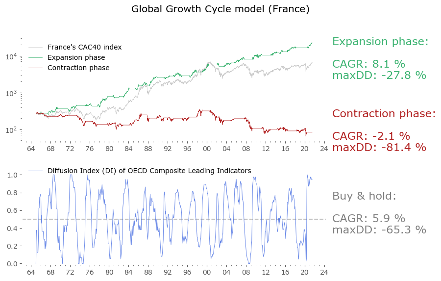
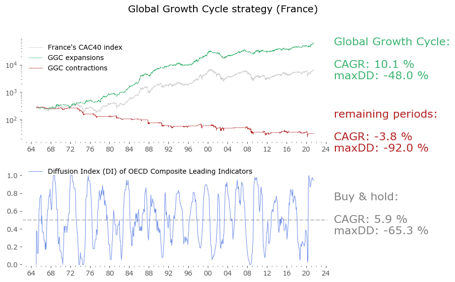
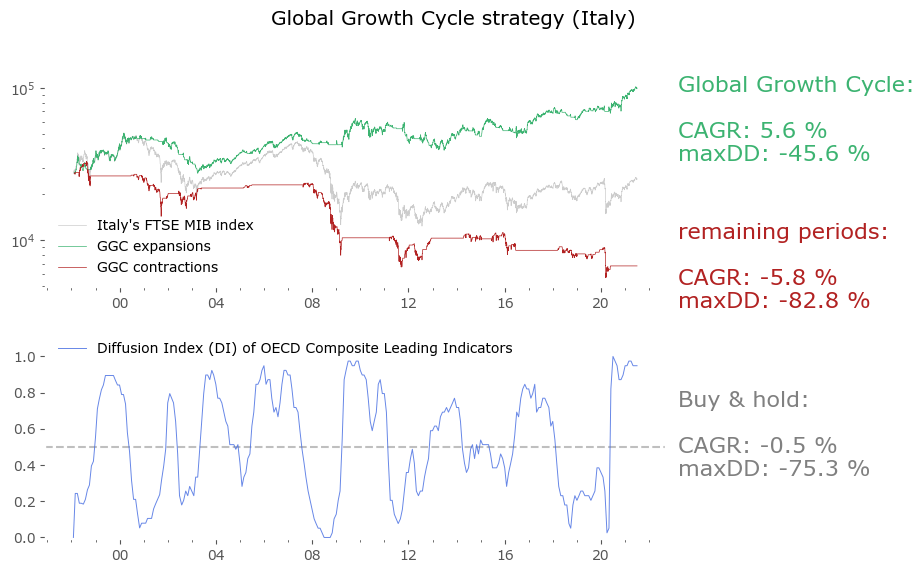
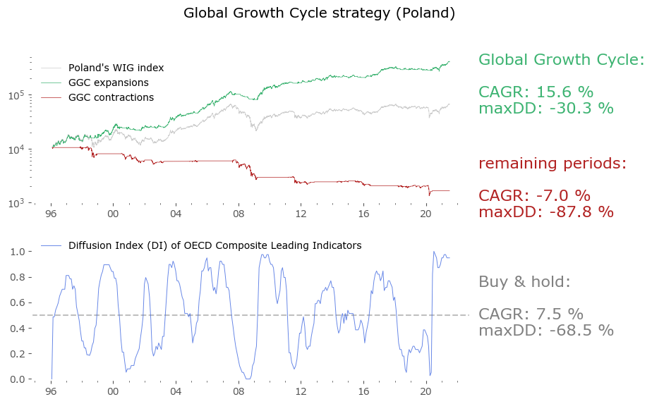
Usually in backtests involving the last decade, S&P500 results outperform all others. Let's take a look at similar timing of other global markets. I've chosen 6 such markets, with all the index data downloaded from Stooq: Australia, Japan, Germany, France, Italy and Poland. Below there are model (all timeshifted 15 days in order to address the publication-lag problem) and timing strategy (timeshifted model + 50-day moving average) results. The charts are small, so click on any of the charts to see a larger version with stats. Below the charts, a table of summary stats is presented.


| Country | Data length [years] | Buy & Hold CAGR [%] | Buy & Hold MaxDD [%] | GGC model CAGR [%] | GGC model MaxDD [%] | GGC strategy CAGR [%] | GGC strategy MaxDD [%] |
|---|---|---|---|---|---|---|---|
| Australia | 66 | 6.5 | -55.1 | 7.6 | -26.1 | 11.2 | -22.1 |
| Japan | 66 | 6.8 | -81.9 | 8.0 | -37.8 | 10.1 | -52.3 |
| Germany | 61 | 6.4 | -72.7 | 7.6 | -29.3 | 10.0 | -48.4 |
| France | 56 | 5.9 | -65.3 | 8.1 | -27.8 | 10.1 | -48.0 |
| Italy | 23 | -0.5 | -75.3 | 7.7 | -24.7 | 5.6 | -45.6 |
| Poland* | 25 | 7.5 | -68.5 | 12.3 | -22.4 | 15.6 | -30.3 |
| U.S. | 66 | 7.4 | -56.8 | 6.3 | -18.5 | 9.2 | -39.2 |
| Canada | 60 | 6.0 | -50.0 | 6.7 | -24.2 | 9.4 | -28.0 |
| Switzerland | 33 | 6.4 | -56.3 | 6.6 | -22.6 | 8.0 | -37.7 |
| U.K. | 66 | 5.2 | -73.1 | 5.9 | -33.7 | 8.1 | -44.3 |
| Spain | 34 | 3.9 | -62.6 | 7.6 | -29.1 | 10.0 | -41.2 |
| Turkey* | 31 | 29.5 | -63.5 | 23.2 | -55.1 | 34.3 | -62.4 |
| Brazil* | 25 | 13.3 | -65.0 | 16.7 | -42.6 | 20.2 | -43.8 |
| India* | 42 | 15.4 | -60.9 | 12.5 | -43.6 | 20.0 | -39.7 |
It's not surprising to see the results are similar. This is in line with the observation of a Global Growth Expansion (and Contraction) effect: when global markets rise, they tend to do so in unison. There are of course individual fluctuations, and this can compound to a sizeable difference, but the general tendency is global.
Emerging markets are noted with an asterisk (*) – their growth rates are significantly higher, but some of this outperformance may come with heightened political risk, higher drawdowns or due to local currency effects. Poland is an outlier with the biggest growth rate gain of the strategy vs the passive buy & hold, but it should be noted that it has one of the shortest date range available – most other developed countries have index data of at least 50 years. Similar is the case of Italy, where the big outperformance of the model (over 8%) vs the passive strategy comes at a short time of only 23 years of data. The outlier results of Poland and Italy must be treated with caution. It would be a useful exercise to check results also for other stock markets, but that is work for another time.
Discussion
The results look promising. This certainly isn't a complete stand-alone portfolio strategy, as no other instruments nor asset classes are considered (for example switching between stock markets, or using cash alternatives during periods of being out of market for the strategy). Trading costs have been neglected, although the 15-day shifted model version of the strategy would require to trade at maximum once a month, usually changing a position no earlier than once in several months. The market-timing strategy (involving a daily moving average) would certainly generate more transaction costs.
A note on revisions. Once again, let's reiterate the CLI's are based on macroeconomic data subject to revisions. The team behind OECD CLI (and other CLI's as well) are of course aware of this issue, and they are taking the best statistical steps available to mitigate this effect (using modelling of unavailable data, which usually captures the dynamic quite well). One of the references[11] specifically addresses this issue. In general, they've found that historically the revisions weren't that very much different from the first published estimates. The revision process is not very volatile.
A good characteristic is that we don't need the absolute values of the CLIs, which change most with revisions, we just need to know the direction of the monthly change (up or down for each country) for the Diffusion Index. This is (usually) a less volatile parameter. Even if some countries' data would differ a lot after revision, most do not, and the aggregate is smoothed out. But of course I'd love to have a time series of unrevised data for as long as possible and run all the tests on them instead. I will be doing so with future data as I'm collecting them in real time now, so probably time will tell how much revision really actually hurts. If this problem would turn out to be so severe as to make the strategy invalid as a working real-time market timing approach, it would still be worthwhile to know a posteriori where the economic turning points were (even after 3 months). And useful - maybe for a different strategy.
The biggest downside to these results is that they are only a backtest. We do not know how the strategies would perform in real-time and on unrevised data. We also do not know if the underlying data will be available in the future at all, or in similar quality (after all, the OECD could decide to stop working on or publishing CLI data). Although this particular problem might be mitigated, as I suspect a similar exercise on other sources of Composite Leading Indicator data would yield similar results. But it is important for the strategy that the data is global, encompassing economic time series from multiple countries and regions.
As always, I caution you to read carefully the disclaimer at the bottom of this page: past performance is no guarantee of future results. Even if all the problems stated above will somehow be resolved, it is still possible that the economy might experience shocks or transformations changing the way global economic growth cycles work. Looking solely at the most recent cycles it could be argued that some kind of lengthening of the 'typical business cycle' is already taking place, but the data is certainly too sparse to decide that for now.
The results open up interesting avenues of inquiry to pursue. One could for example use these signals to look for other factors that might have an influence. Inflation, for example – most of the time period studied occurred during a period of falling interest rates. It is perfectly possible that the results will be quite different in a rising interest rate scenario, and it would be interesting to see if there such an influence. Similarly, a more in-depth look at global markets would be interesting. Does using emerging economies' data work as good as for developed ones? Maybe constructing different Diffusion Indices for a subset of countries would be beneficial? And another idea – is economic data even that important at all? Maybe substituting CLIs with a wide range of countries' stock markets breadth is sufficient for a CLI replacement? The upside would be totally no data lag, and practically no revisions.
Most of all, I invite the reader to recreate the results independently. It could be the case that I have missed something or made a mistake. The complete procedure is given above – feel free to reach out in case of any questions. I will be happy to know if there is any other interesting work on this subject – the references listed below are the most relevant I have found so far.