The Yield Game
Table of contents: Stock and bond yields, Results: charts, Results: table, Predicting stock returns, Projection, Discussion, References
Asset managers are often fixated on predicting the best performing asset in the near future – be that a month ahead, six months, a year or two. Of course, it would be great to know what will appreciate in price the most (and subsequently – what to invest in right now), but all we can do is predict. And predictions are far from certain. They sometimes – if not usually – fail. Near-term predictions are prone to be fooled by local randomness, while longer-term predictions may suffer from larger economic paradigm shifts that render the assumed correlations invalid.
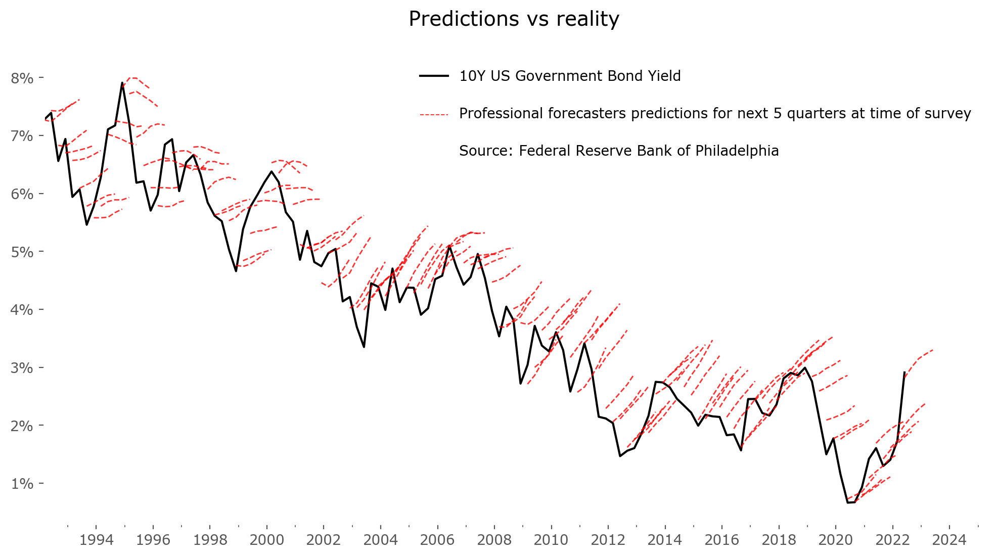
Nevertheless, predict we must. Even if reality turns out wildly different, we need to have a plan. Passive investors might fret right here, arguing that market timing is not necessary, but even they must set some goals for their portfolio, and from these goals (and assumptions for asset returns extrapolated from historical averages) choose a portfolio structure suited for these goals (a 60/40 portfolio or 80/20? Include other assets or not? What currency to base their assets in? Diversify with different geographical regions or not? Etc.). A prediction is inevitable, but it's important to take any and all predictions with a grain of salt and to keep in mind that some (or most) of the prediction will likely turn out false. Figure 1 presents an example: the predictions of professional forecasters for the 10-year government bond yield for 5 nearest quarters ahead.[1]
A rally and a trip
If getting the best investment return could be likened to a race, asset managers fixing on the near-term could be seen as rally navigators (co-drivers), focused on the nearest twists and turns and trying to complete them safely in the best possible time. That is, of course, how to win a race. But if getting from A to B in the simplest possible, most economical way is a priority, and the specific twists and turns along the way don't matter as much (as they do for normal asset allocators, who have to worry about drawdowns and beating the competition), a different approach is also possible: a total yield approach. This is what I'd compare in our 'race track analogy' to energy-efficient driving.
For an energy efficient driver, speed is not a priority. Fuel efficiency is. The total mileage after a long time driving matters more than quick bursts of acceleration. As is often the case for an investor in real assets – the return after a specific amount of time is much more important than what happens to the principal along the way. As long as there is no loss of the principal of course. In finance this approach is most commonly observed in bonds.
Bonds are suitable for such an approach: first of all because they are a lot less volatile than stocks, second of all because they operate in fixed terms. They are issued for a fixed amount of time (a 3-month, 2-year or 30-year bond for example), and although the price of these bonds on the open market varies, the promise of the issuer is that they will return the total money borrowed (principal) at the end of the fixed period, plus issue regular interest payments along the way. That way – at least theoretically, assuming no bankruptcies – the lender does not have to worry what happens with the principal in the meantime, just what the total yield becomes.
Imagine such an approach for stocks – not looking at what happens to prices in the meantime, just looking at the long term yield. For some this might seem exotic, as the volatility is something they treasure and search for, and these would be rally racing drivers. For others, this is exactly what a long-term investor should be avoiding: ignoring the short term fluctuations and looking at possible total long-term yields. This group of people could be seen as fuel-efficient drivers.
Stock and bond yields
A most common chart to look at in bonds are 10-year government bonds.[2] This is a popular standard valuation measure – as most countries issue such bonds, they are directly comparable between each other. As a general rule, the more "socio-politically volatile" countries (most commonly emerging or even frontier countries) offer higher yields on their debt obligations, and the more "economically safe" countries offer lower yields. Specific events (such as: war, economic crises, revolutions, etc.) have an effect on yields, as the price of the issued bonds reflects not only the expected yield, but also a probability that the issuer will not be able to return the principal in the agreed time (i.e. will experience a bankruptcy, a default). Such events, although rare, do happen, and countries with significant risk of default usually have exceptionally high bond yields reflecting this risk.
So taking both into account, let's look at charts showing countries' 10-year government bond yields, relative to their 10-year forward main stock market index returns (forward CAGR.[3]) The first country, with the longest known data (backfilled through various processes) is the U.S. market, shown in Figure 2.
It is interesting to see that 10-year yields of the stock market fluctuate in a roughly cyclical manner (although the cycle period is of varying length). Times of prolonged successful periods for stocks usually result in a worse period for this asset class in the next decades, and vice versa. Bonds on the other hand seem to experience extremely long, 3-4 decades of uptrends or downtrends, but in general vary much less.
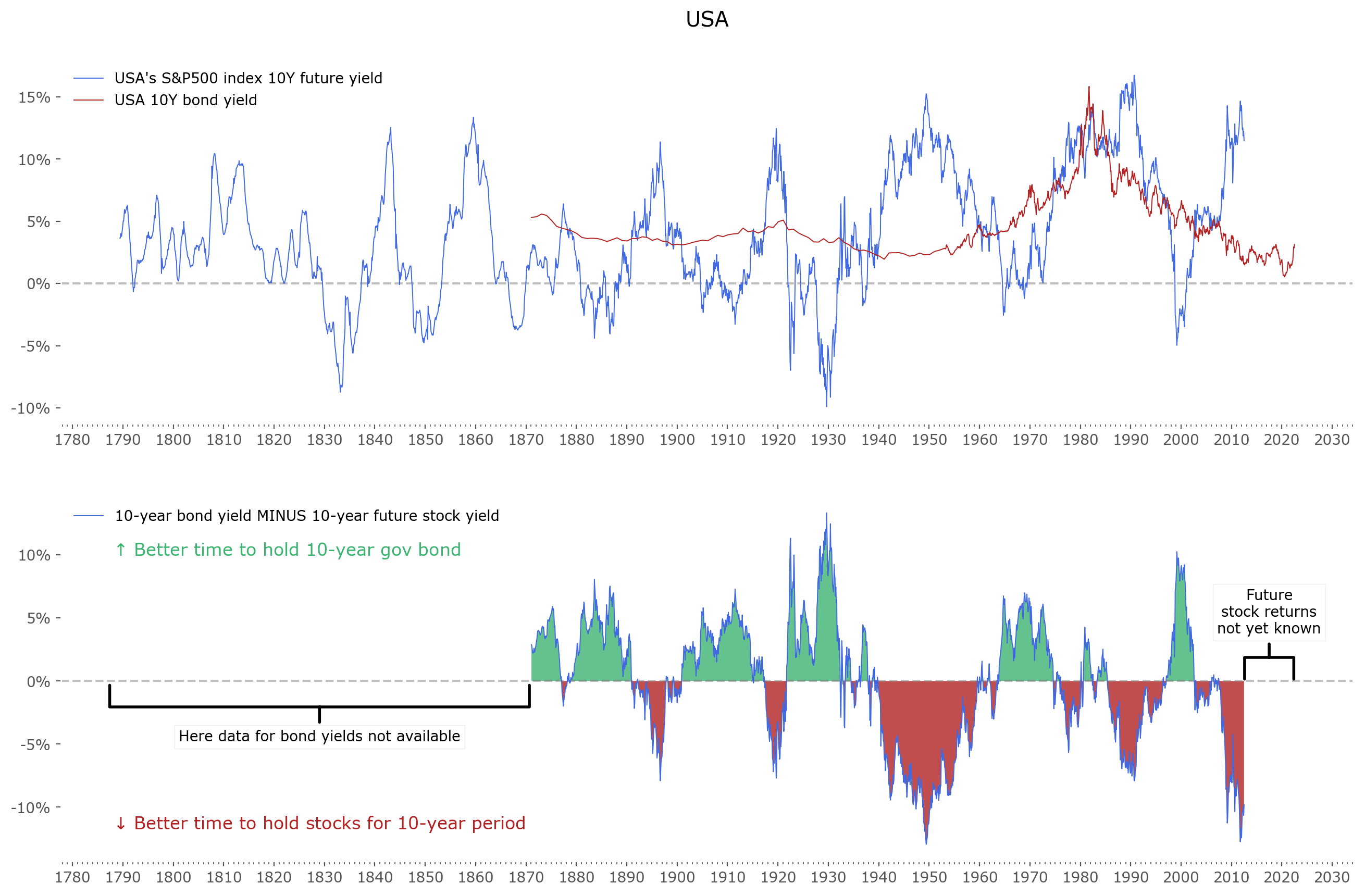
Fig. 2: US stock market forward 10-year returns (upper panel, blue) and 10-year government bond yields (upper panel, red). The difference between both is shown in lower panel – with green regions highlighting areas where future returns of bonds were higher than that of stocks and red areas vice versa. Data for yields are available from 1871. Data for stocks prior to 1957 (S&P500 index inception) is extrapolated (backfilled) using historical stock indices and historical research data. The resulting time series is known as early as 1789, although one ought to maintain a healthy skepticism of data quality from that time. Source of the data: Stooq.
The difference between both yields is shown in the lower panel. Keep in mind – this data is price only, so does not include dividends (for the stock market) or inflation (for both asset classes). One could argue that inflation will cancel out in the difference at the lower panel, but due to the non-uniform effect of inflation, it might not be so simple. Stock market dividends should push the difference line lower, making stocks a slightly more favorable asset class (the average dividend yield in the last century varied around 2-4%, with current values near 1.5%).
A total return version of this lower panel chart (10-year stock market returns minus 10-year bond yields) for the U.S. market, taking into account both dividends and inflation, can be easily recreated using the comprehensive data tables listed and updated on Robert Shiller's website.[4] I invite the reader to go have a look and recreate this chart as an exercise.
What can be done next is a look at the same data for other countries. Figure 3 shows a compiled a list of charts for 12 other countries stock and bond market yields. Click on any chart to zoom. Unfortunately the data series available are much shorter that for the US market – for most bonds it's from the 1970s.[5]
Australia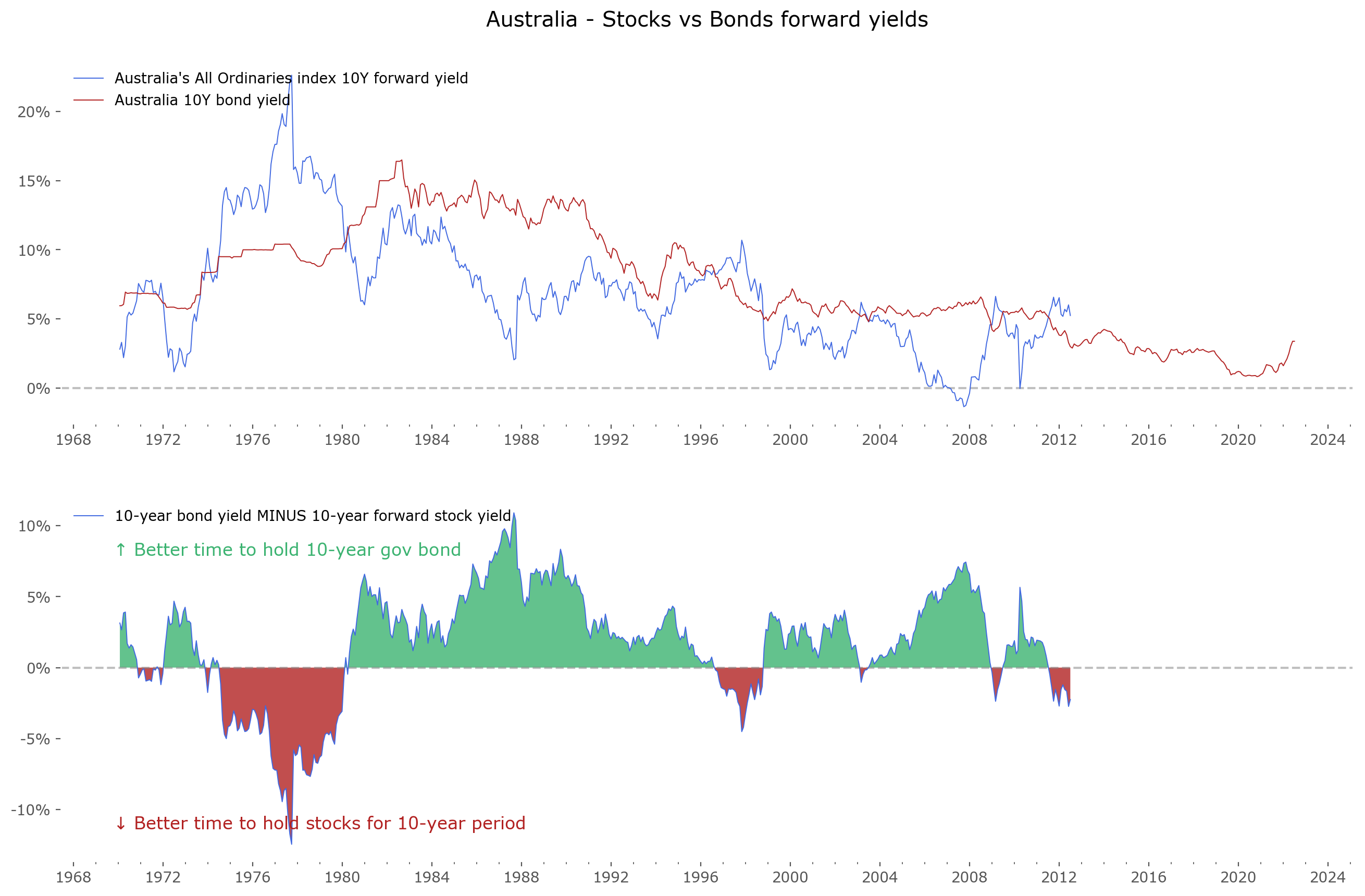 |
Canada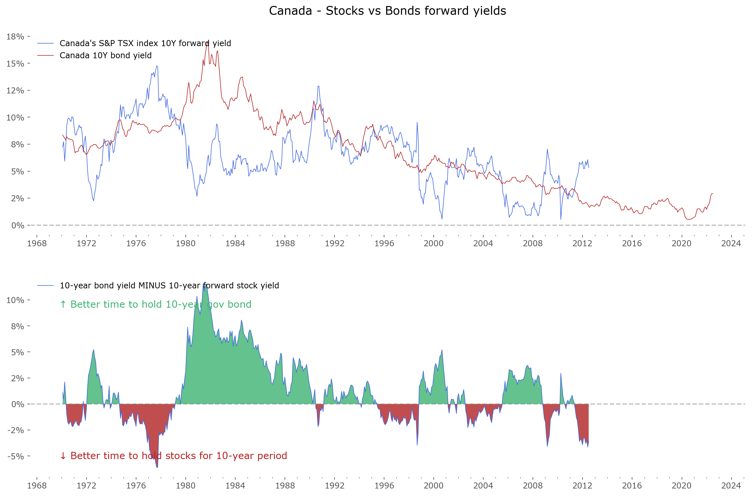 |
France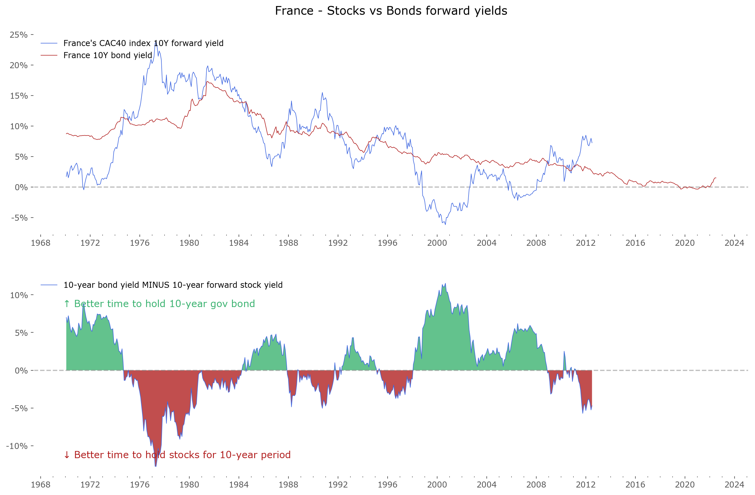 |
Germany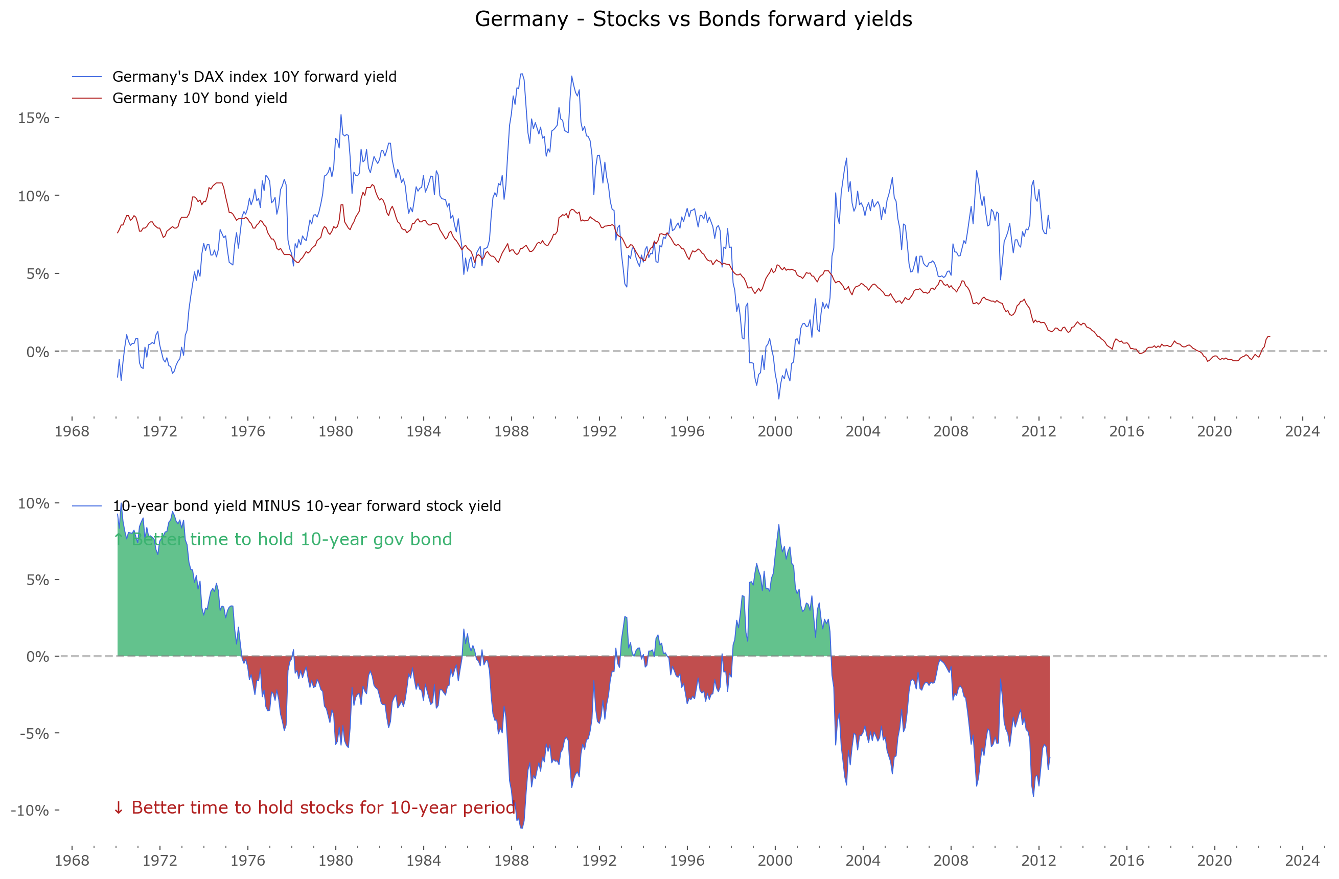 |
Italy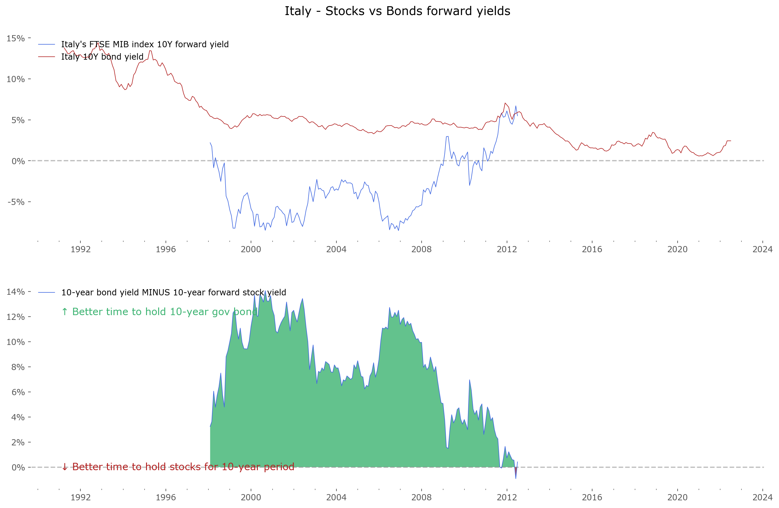 |
Spain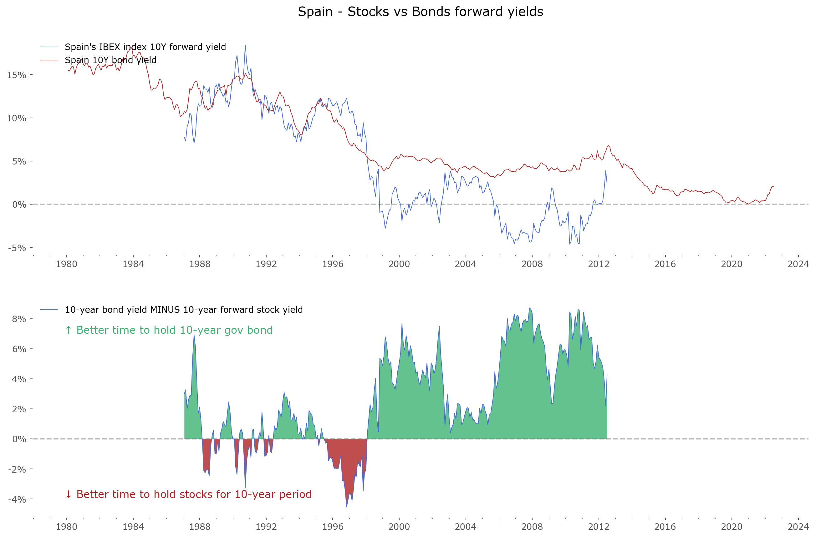 |
Switzerland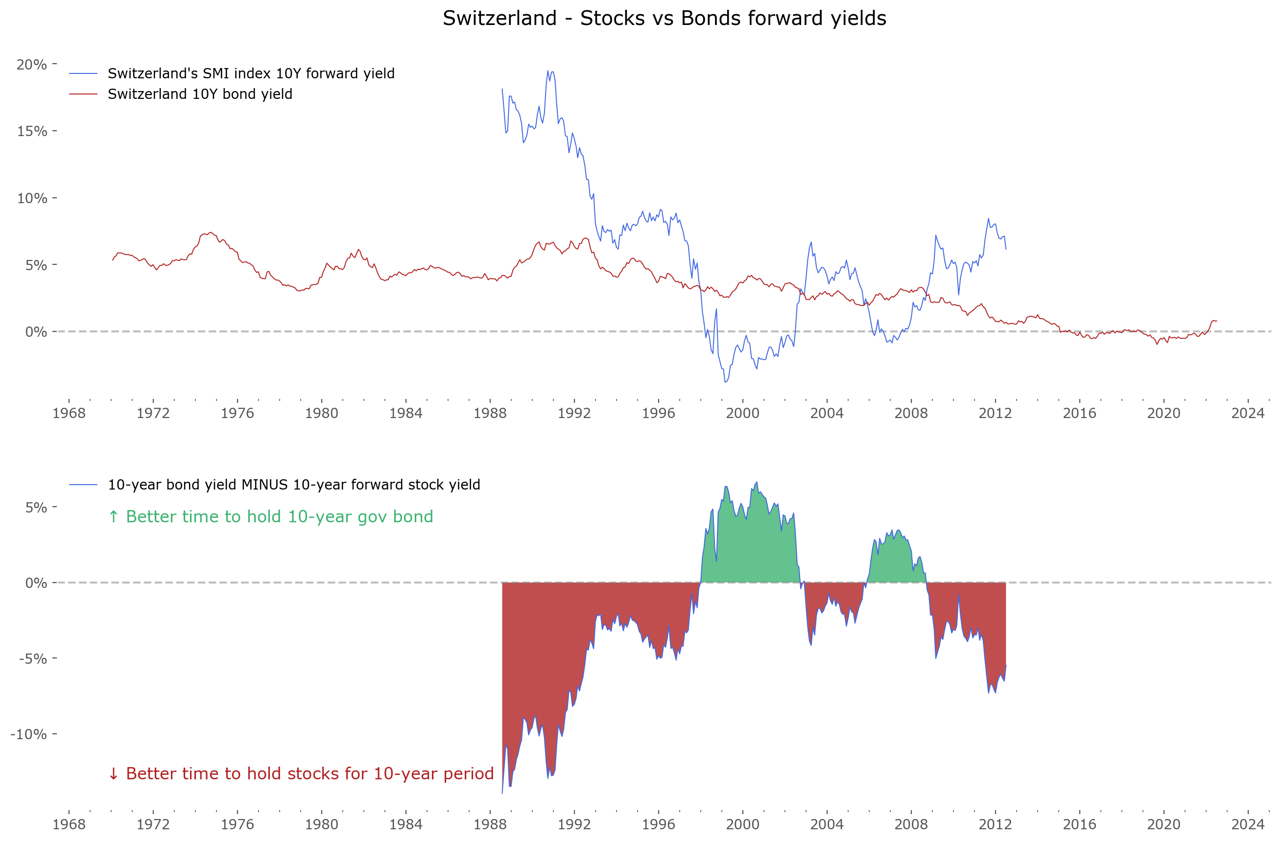 |
United Kingdom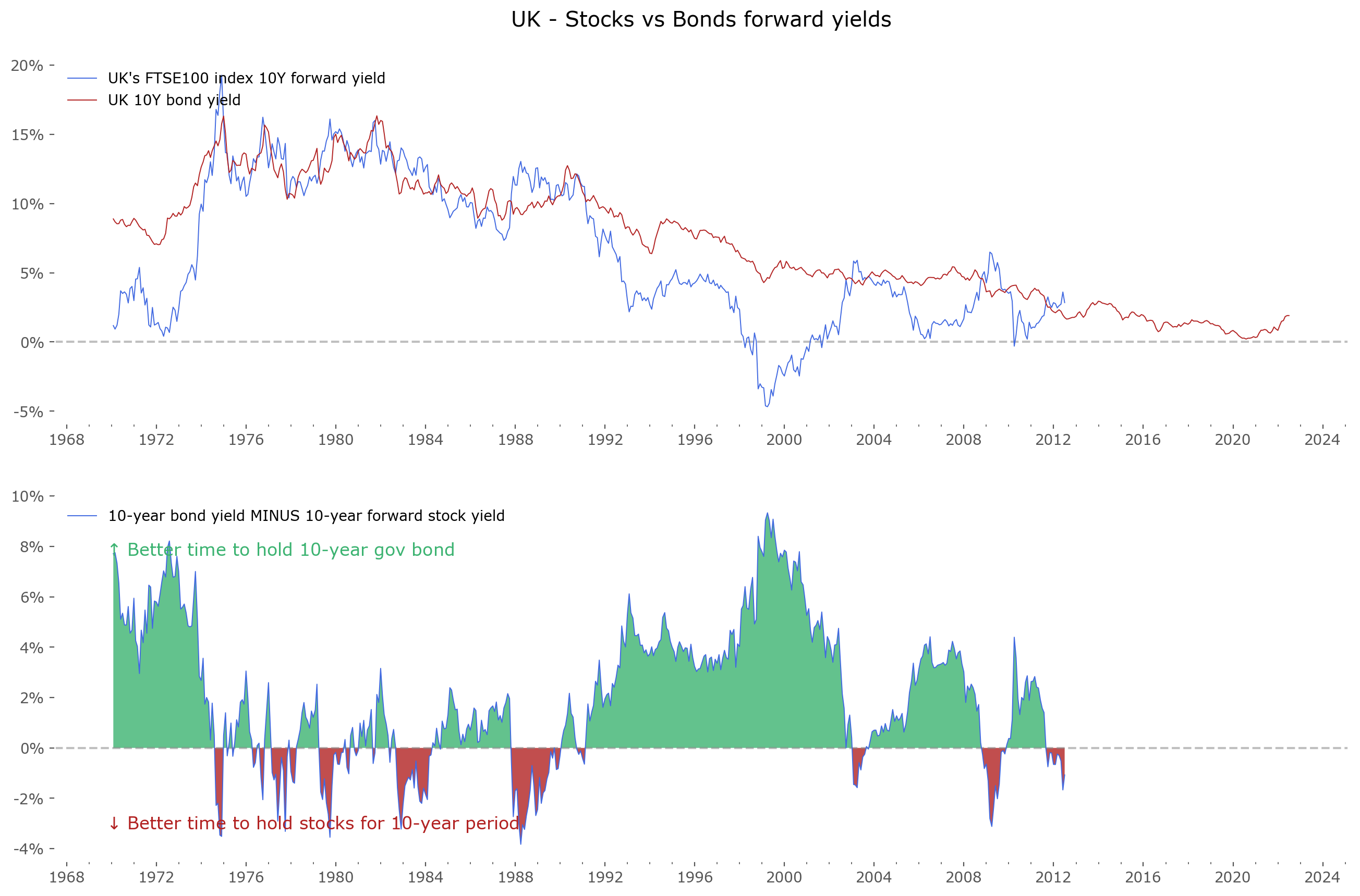 |
India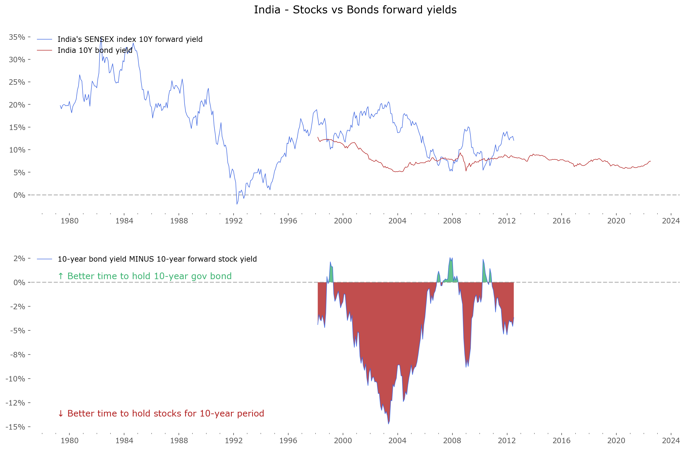 |
Japan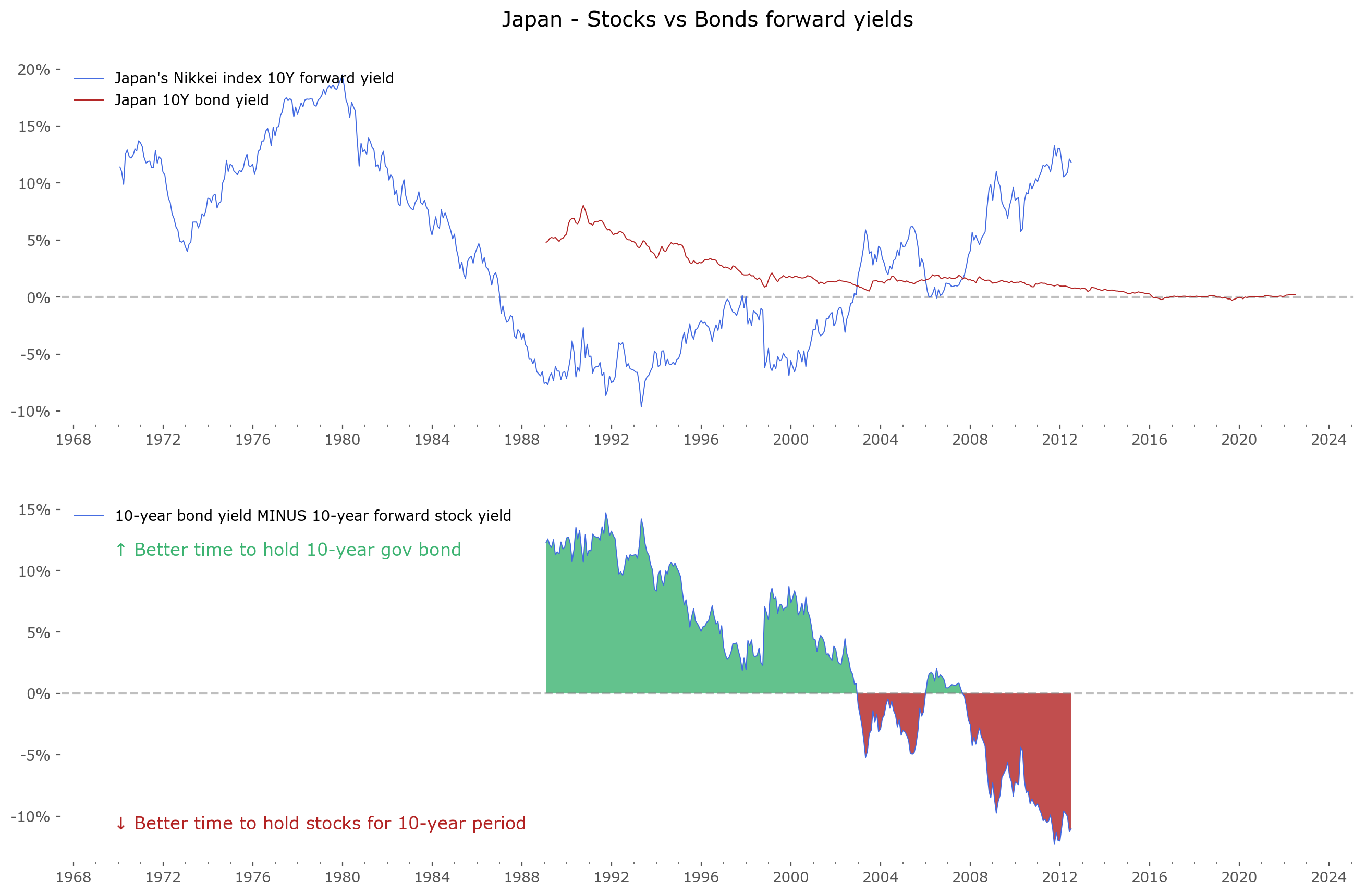 |
Poland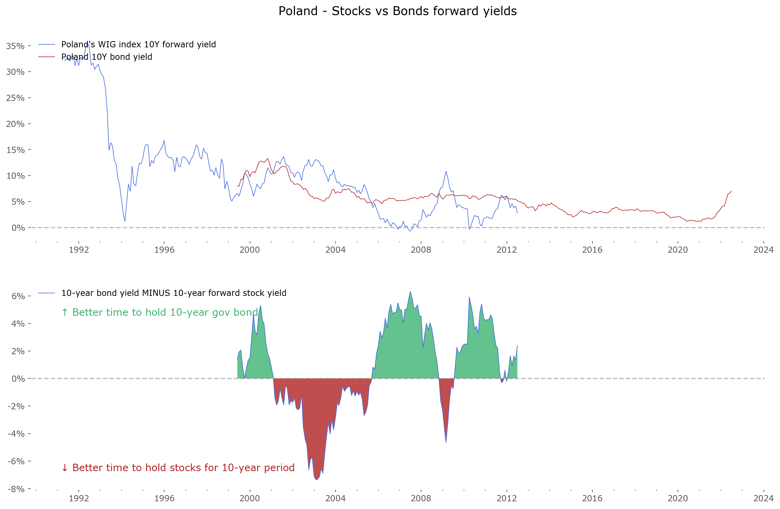 |
Sweden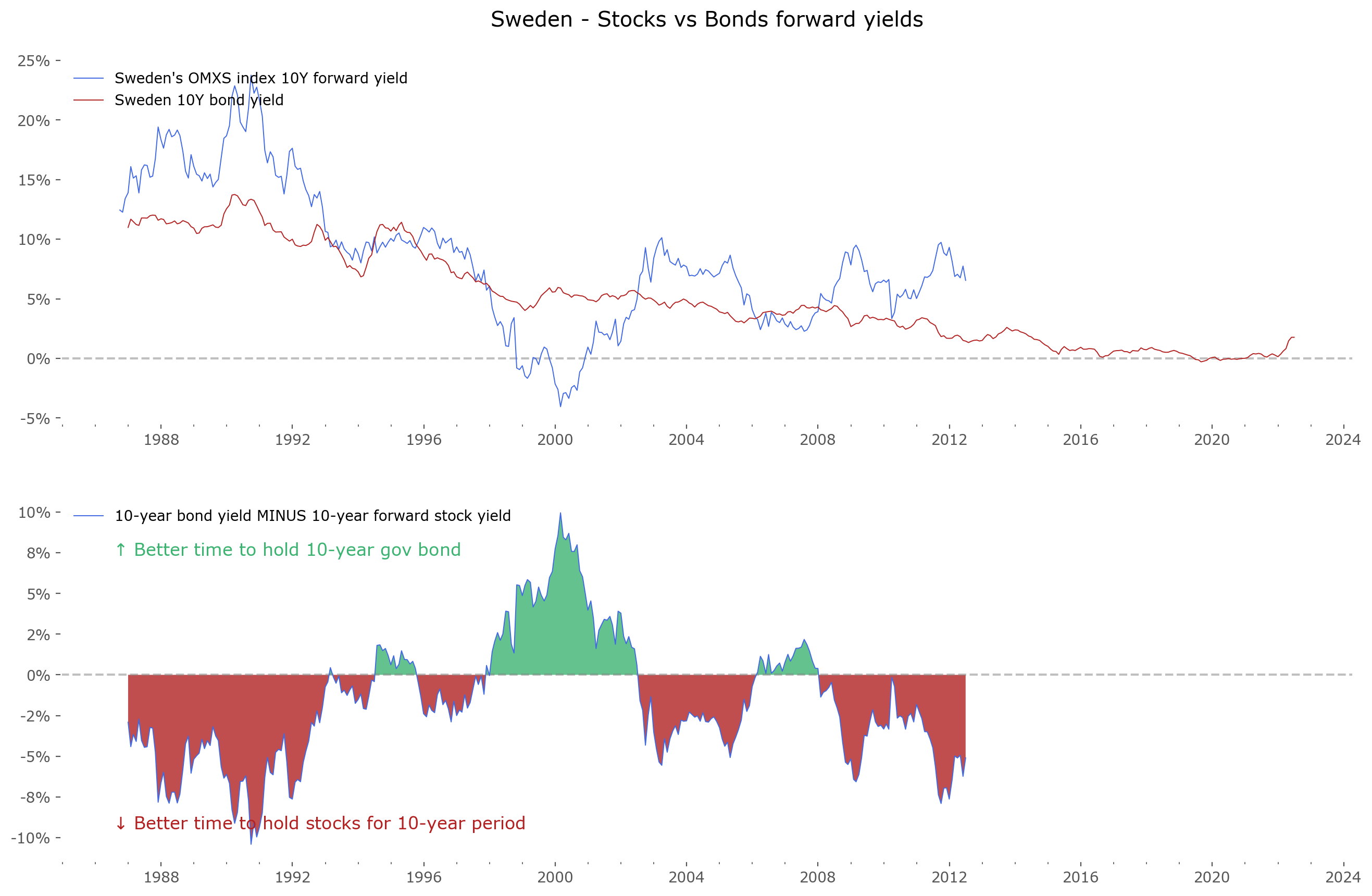 |
Fig. 3: The stock-bond 10-year yields for 12 select countries. Data availability varies between markets. The main stock market index in local currency is shown. Most of these indices are price-only and do not include dividend payments, with the exception of the german DAX and polish WIG being total return, including reinvestment of dividends. Inflation is not taken into account. Click on any chart to zoom. Most data for 10-year bond yields is from Federal Reserve Economic Data (FRED), data for India and Poland is from Investing, all index return data from Stooq.
What can be seen quite clearly from the charts (and what is inline with common sense), the best time for bonds future outperformance over stocks was near market extremes – such as the market peaks around the year 2000 or 2007. Nearly all of the markets have green regions around that time. Another very good time for investing in bonds is the 1980s, at the beginning of the current 4-decade long bond bull market (which some suspect, now be coming to a halt). On the contrary for stocks – the best time to prefer them over bonds has been at notable market lows, such as 1950 (for the US), 1978 and 1990 (for most international markets), and recently at the 2009-2011 lows.
Table 1 shows the summary statistics (average and length) of all the data seen above. Be advised, these are not the same as a total CAGR over the whole holding period: it's an average over separate, overlapping, 10-year holding CAGR periods. The lengths show how long data is available – the longer, the better, although keep in mind that the exceptionally large values for US data are based largely on extrapolations of returns for the XIX and most of the XX centuries – take these results with a bit of skepticism. Remember that stock data do not include dividends (historically about 2-4%, now 1.5%), and both yields do not take into account inflation (historically around 2-3% for the US market, but varies wildly for emerging markets such as Poland or India).
| Country | Average of Stock 10-year forward yields, % | Average of Bond 10-year yields, % | Length of data (stocks), yrs | Length of data (bonds), yrs |
|---|---|---|---|---|
| USA | 3.9 | 4.5 | 233.2 | 151.5 |
| Australia | 7.1 | 7.6 | 52.4 | 52.4 |
| Canada | 6.5 | 6.6 | 52.4 | 52.4 |
| France | 7.2 | 6.7 | 52.4 | 52.4 |
| Germany | 7.6 | 5.2 | 52.4 | 52.4 |
| Italy | -3.3 | 5.3 | 31.3 | 24.4 |
| Spain | 4.7 | 7.4 | 42.4 | 35.4 |
| Switzerland | 5.7 | 3.4 | 52.4 | 33.9 |
| UK | 6.5 | 7.2 | 52.4 | 52.4 |
| India | 15.4 | 7.9 | 43.2 | 24.4 |
| Japan | 4.0 | 1.9 | 52.4 | 52.4 |
| Poland | 10.2 | 5.3 | 31.2 | 23.1 |
| Sweden | 8.4 | 5.0 | 35.8 | 35.5 |
Predicting stock returns
Let's now turn our attention to something more fun and much less serious: predicting the future. As stated in our long introduction, predicting largely fails. Nonetheless we have to try if our aim is achieving better-than-average market returns. After all, this is what investors do, when deciding what to invest surplus capital in: assess possible yields from different asset classes, and settle on the ones that look most promising. Let's assume we take the 'fuel-efficient driver' approach: not worry about twist and turns along the way, just look at getting to the destination in the most efficient way. We'll be looking at 10-year future yields. Let's call this the Yield Game – in our simple example focusing only on stocks and government bonds.
The excellent Philosophical Economics blog has an article about what they called the "Single Greatest Predictor of Future Stock Market Returns".[6] It's a great explanation on how a single variable correlates very well with future (10-year) stock market returns: Average Investor Equity Allocation. The aggregated data for the US is available at FRED.[7][8]
The article is from 2013, so let's run a little update on the data. Figure 4 shows the same methodology applied to today's data. Data on equity allocation from FRED is on a quaterly basis, and the latest quarter available is for 1Q 2022.
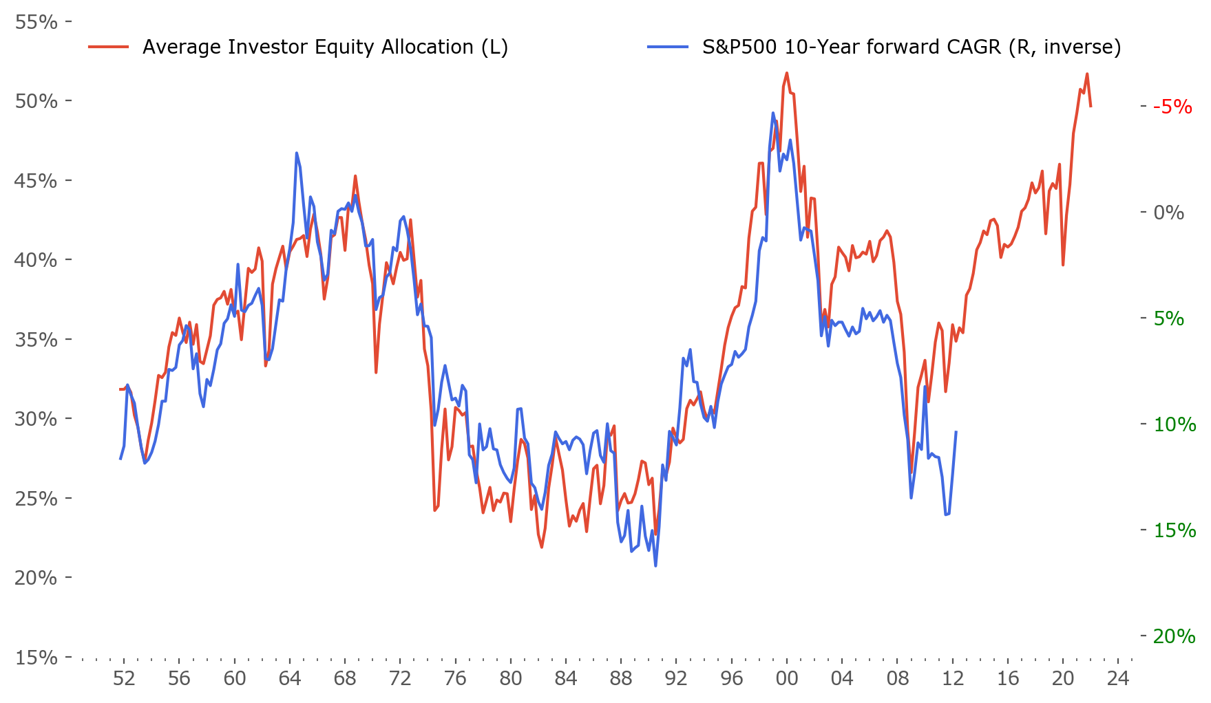
Fig. 4: Average Investor Equity Allocation of US investors vs subsequent 10-year forward return on the S&P500. Data: FRED (allocation), Stooq (prices). Note the inversion of the right axis – higher allocation values correspond to lower subsequent 10-year forward returns and vice versa.
As one can see, this prediction has one severe flaw – it is very sensitive to the starting and ending points of the fitting curve taken from the Equity Allocation. As the correlation is not exact, the ending point of the 10-year known return is always a bit different than the corresponding allocation. Sometimes very much different. This "phase shift" is crucial for the prediction, as even if the path (curve) of future returns will be similar, the start and ending points depend very much on the size of the shift. The shift decides the predicted yield. Especially now, when at the end of the return data (2012) the shift is exceptionally large.
To accommodate for this, I've included 2 scenarios: a minimal and a maximal, both assuming the changes in forward returns will act exactly as past changes in equity allocation have, but that the phase shift will stay the same or vanish at the end. The space between them is the expected return range. This is what is shown in Figure 5.
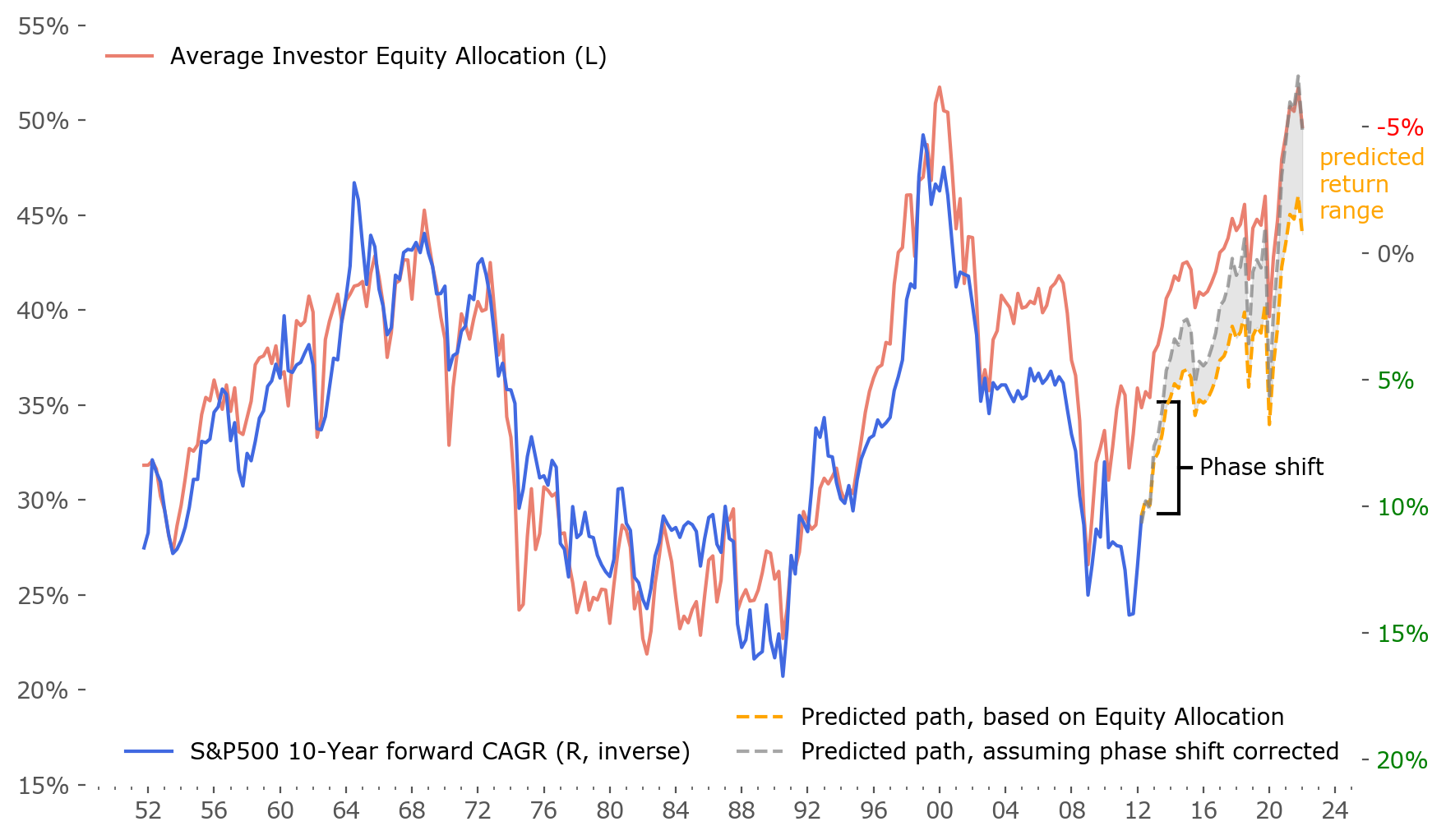
Fig. 5: Same as Figure 4, but with prediction based on Average Investor Equity Allocation of US investors added; susbsequent 10-year forward return on the S&P500. Data: FRED (allocation), Stooq (prices). Note the inversion of the right axis – higher allocation values correspond to lower subsequent 10-year forward returns and vice versa.
This measure suggests subpar future stock market 10-year returns – from -0.7% CAGR to -4.9% CAGR. This is in line with projections from other measures of valuation[8][9] (such as Shiller CAPE ratios).[10] Bear in mind this projection does not take into account dividends (historically around 2-3% per year), so the total return can be expected to be that much higher.
Also, remember these values are for latest available data in equity allocation, which is for the end of the first quarter of 2022, March 31. So any future returns should be calculated from S&P500 price from the end of March – which was about 4530. At the moment of writing (end of June 2022), the current price is around 3900, which is 14% lower. This additional "boost" from current price levels suggest an additional 1.3% CAGR (= 14% annualized) of returns higher, give or take.
The last thing to do is to include this projection into the chart shown in Figure 2. This is done in Figure 6. This is the current state of affairs. If this projection would turn out to be correct, currently priced 10-year bonds (yielding about 3.2% to maturity) would be the better choice of these two asset classes under consideration 10 years from now. At least that's the outlook for the US market – other countries may vary significantly.
The state of the Yield Game seems to be that – at this very moment – bonds seem to be the more compelling choice to make.
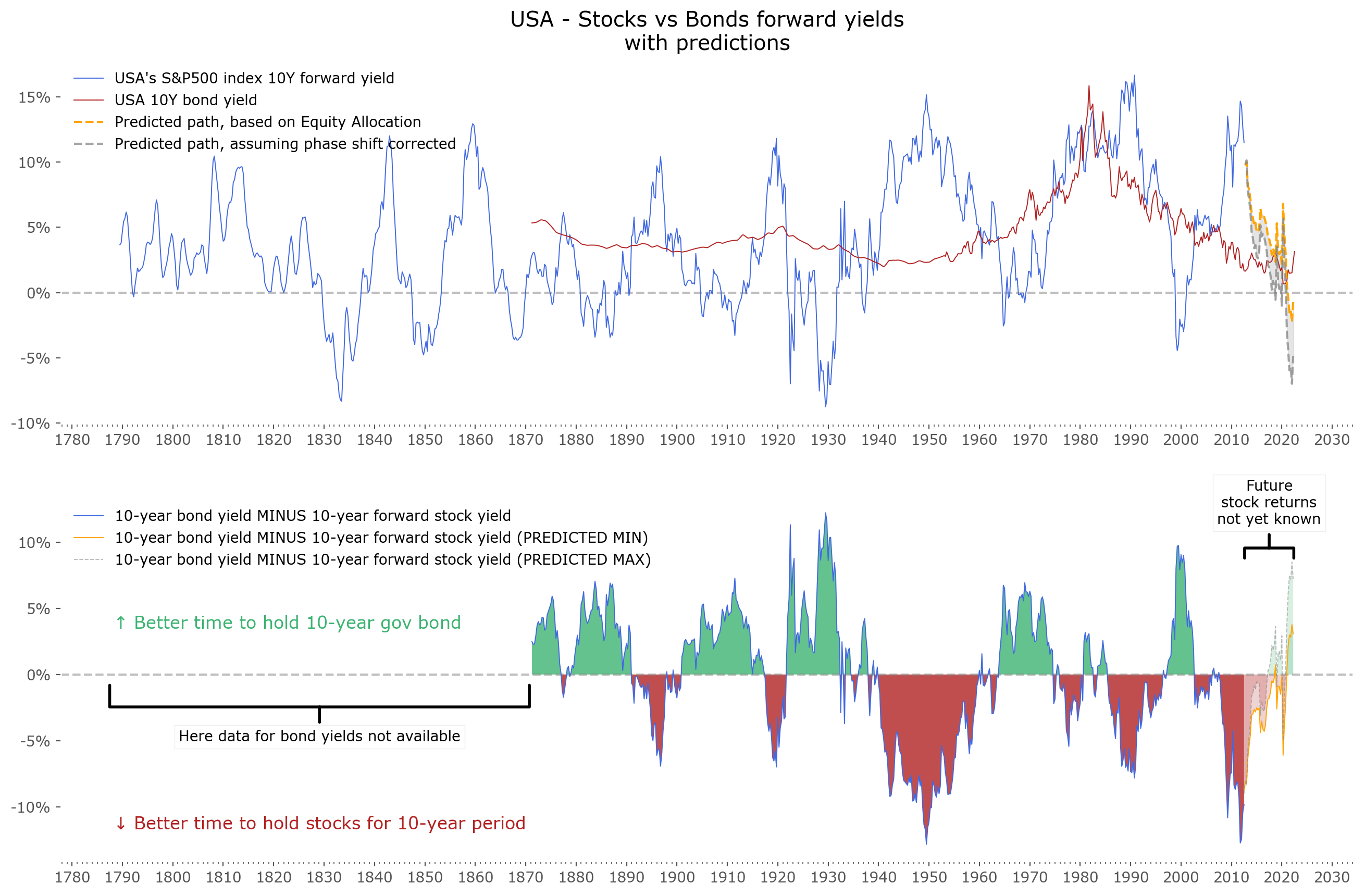
Fig. 6: US stock market forward 10-year returns (upper panel, blue) and 10-year government bond yields (upper panel, red), just as in Figure 2, but with added future return projections. The difference between stock forward returns and bond yields is shown in the lower panel – with green regions highlighting areas where future returns of bonds were higher than that of stocks and red areas vice versa. Data for yields are available from 1871. Data for stocks prior to 1957 (S&P500 index inception) is extrapolated (backfilled) using historical stock indices and historical research data. The resulting time series is known as early as 1789, although one ought to maintain a healthy skepticism of data quality from that time. Source of the data: Stooq. Projections taken from average investor equity allocations, data via FRED.
Discussion
There are plenty of caveats. As stated in the introduction – all of this is just simple research. Just a game of predicting. It's important not to expect too much of the results. It might turn out some seismic economic shift turns the relation of Average Investor Equity Allocation to 10-year stock market returns on it's head, and the results obtained here might turn out wrong. It might be that the bond market experiences critical defaults, and then bond yields skyrocket to previously unknown levels. All that we've seen here is just that assuming correlations from the past ~70 years hold – the bond market should be a better and less risky play from today to 10 years forward.
As I often try to remind the reader – past results are no guarantee of future returns. Keep in mind the disclaimer at the bottom of this article.
It's nice to see these results being inline with some other known valuation methods and their predictions, such as the CAPE ratio. It's by no means a guarantee, but it's always nice to see different analysis methods arriving in similar conclusions.
It's interesting to note that in most countries' stock/bond forward yields, there have been quite significant swings between the profitability of both asset classes. One might expect one to be "always superior" to the other, while this is not the case. With bond yields being much less volatile (and rarely diving into negative territory, at least in nominal terms), it's probable the volatility of stocks are the main driver of this phenomenon. In short: stocks have times when they are extremely profitable to invest in, such as the known today multiyear lows of 1950, 1990 or 2009. They also experience at the other side of this pendulum, times when they should not and will not yield very highly even in decades to come. The year 2000 comes to mind as an example of such times, as were the late 1960s, and 2021 might be a good candidate for another.
For some countries with especially weak stock market performance (such as Spain and Italy in the latest decades), bond yields almost always turned out to be the better choice. But keep in mind: this might change in the future for these regions, and that the data history for those specific countries is one of the shortest available.
Assuming this methodology holds in the coming decades, one very interesting cross-check would be to obtain similar data for equity allocation for investors in other countries. Would they relate to those countries' 10-year forward returns just as well? It would be interesting to check how general this phenomenon is.
Regarding the "single greatest predictor of market returns" – it would be interesting to know how exact the correlation can be at it's best and what drives the remaining differences. For example – recently there has been a relatively large "shift" (labeled as a "phase shift" in Figure 5) between projections from asset allocation and obtained 10-year returns. How severe can this be? Can it be explained by any known factors, and are those factors mean-reverting? In other words: must it be corrected in the projected time scale or can it stay shifted for extended periods of time? These are crucial bits of information, as this 'phase shift' corresponds to a difference of about 5% in expected stock market yield of the projections.
An obvious extension of this research would be including both dividends and inflation data for each of the selected markets. Especially for emerging economies, this might twist the results in a very big way, and could go both ways (pro-stocks or pro-bonds as well). Also including more countries would be welcome. Of course, including additional asset classes, such as real estate for example, would be most welcome. Please let me know if you find any such research elsewhere.