Spearman's rank correlation of technical indicators
Table of contents: Study motivation and methodology, Scatterplots, Coefficients, Parameters, Velocity, Discussion, History, References
RSI, MACD, Stochastic, ROC, CCI, %b - technical indicators come in many shapes and sizes.[1] Their names suggest something very technical at play. Maybe even scientific. Yet, they are a polarizing tool. They generate strong, opposing opinions. Some traders value them with near religious zeal, while others despise them as a useless mix of witchcraft and salesmanship, and quite simply, scams. Or at the least, useless backward-looking information.
To me, both these attitudes are a bit silly. There's a middle ground. These are just tools - useless in the hands of an unskilled user, but quite useful in their correct setting. They don't do anything for you on their own and won't predict price movements or substitute risk management. They can, however, be informative. As it turns out, they're also pretty similar.
Occasionally the question, 'does technical analysis really work' shows up, with generally no accepted answer.[2] Some people say it doesn't. Some differentiate between the objective indicators that work and the subjective interpretations that don't. That's fair. You don't see people asking "do hammers really work", "can wrenches fix things" or "are pianos useful?". They're all just instruments. If you master them, you can play great music. It's more a question about the user, not the tools being used.
A great example comes to mind when thinking about price indicators, and I'll explain in a bit why this is especially accurate: the speed meter in a car. You don't rely on the speed meter to drive you. You could come up with simple rules while learning to drive, like "always speed up when I'm driving below 30 and slow down when over 70", but that would be crazy. Without context it would be dangerous. Much depends on the surroundings - in a built-up area, driving over 50 (km/h) is usually too fast, but driving that slow on a highway would be a mistake.
So, why are we talking about speed? Well it turns out, most of these indicators have a similar output. It isn't obvious at first from their construction, as they employ different methods of measuring, but a correlation analysis shows that beneath the hood they share highly similar dynamics. And it happens that they are not very dissimilar to the physics concepts of velocity (the first derivative of distance) and acceleration (the second derivative).
We can think of price as being a sort of position metric (in a 1-dimensional world, a number on a scale that can only go up or down), while the indicators show how fast that metric changes (the speed + the direction = the velocity, the 1st derivative) or how fast it accelerates (2nd derivative).
Study motivation and methodology
There is a plethora of indicators available. I will focus on a handful of the most popular, most commonly seen in market analyses, technical market reports and the like. In this short study I've selected the Rate of Change (ROC), Relative Strength Indicator (RSI), Commodity Channel Index (CCI), Moving Average Convergence-Divergence (MACD), Bollinger band (in the form sometimes called %b) and the Stochastic oscillator. I will compare them with my favorite of them all -- a simple price vs moving average cross-over.
I do not reproduce here the definitions of each indicator, as they are easily found online, but I invite you to look each one separately on Wikipedia if interested.[1] It's enough to say that most involve a lookback period of n-days of the recent price, where the n is a choosable parameter. Some, like the MACD, have additional smoothing parameters.
As I've employed earlier in a cryptocurrency trend following strategy, and the Global Growth Cycle strategy, a simple Moving Average (MA) filter can be useful. Its sole rule is requiring the price to be above its "moving average" -- an average of its most recent n-period values of price, updated with each new datapoint. It's a market timing filter that screens for time-series momentum, one of the simplest available (in contrast to cross-sectional momentum, which measures relative momentum between assets).
This is what I will refer to as MA Distance: The distance of the (most recent) price from its moving average. A positive value signals a price above the average, and a negative value means the price being below.
Two of the indicators - MACD and MA Distance - are not normalized; meaning their variability will rise gradually as the underlying price (S&P500 index) rises over time. To account for this (and keep the readings from 1970s comparable to the newest ones of the 2020s, when the stock market index is ~50x higher, and so are the accompanying price moves), I add a normalization factor, which is price dependent. For both these indicators it is just dividing them by the current price or the current moving average price. You could also use other functions of price, such as a "True range" indicator, Mean Average Deviation, or a standard deviation of prices as in %b. It's not important which of these normalizations you choose, as both will lead to nearly the same results over long time scales (since they do not differ significantly for small lookback periods). The remaining indicators typically divide current prices over recent ones (low vs high, current vs low, and so on), so they are stable over time. Both the numerator and denominator contain a measure of the recent price, and so they do not require a normalization factor. In both MA Distance and MACD, only the numerator contains (absolute) price, so a normalization factor is required, to make the scatterplots comparable. So in general:
![\begin{align*}\textbf{MA Distance} &= [\textup{price} - \textup{MA}(\textup{price}) ] \cdot \textup{Normalization factor}(\textup{price}) = \\ \\ &= \underbrace{[x_1 - \frac{x_1+x_2+...+x_n}{n}]}_\text{rapidly changing and signed}\cdot \underbrace{\text{Normalization factor}(x)\frac{}{}}_\text{slowly changing and always positive}\end{align*}](media/indicators/Eqn-0.svg)
where x1 is the latest price, xn the price n-days ago. x can be chosen to be any of these prices, just not very distant relative to the latest one. The normalization factor is always positive, so the main interesting features - when MA Distance switches from negative to positive, and vice versa, or when they are relatively distant - is left unaffected by the normalization.
We could just switch to rates of change and the need of normalization would disappear. Nonetheless, let's keep the absolute price-based indicators, as they seem most popular in typical "technical analysis" software.
In Figure 1. I compare the different technical indicators with the MA Distance and with each other, by employing pair by pair scatterplots. The correlation between points (how much one indicator changes with a change of the other) hints at the relation between indicators. Values close to 1 (or -1) signal a close relationship; values closer to 0 hint at variable independence.
As some of these indicators are bounded (as the RSI, or the Stochastic oscillator, both within the range of [0,100]), and the other are unbounded (as the MA Distance or ROC, Rate of Change), it is rational to expect the relation between points will not necessarily be linear. But it can be monotonic. That is why instead of Pearson's correlation coefficient (which measures linearity) I opted to calculate Spearman's rank correlation coefficient (which measures monotonity between variables,[3] meaning they fall or rise together, not necessarily linearly). These coefficients are shown on Figure 1 in the descriptions, as well as summarized in Table 1.
The plots only show RSI, ROC, MA Distance, CCI and the main line of MACD, with %b and Stochastic omitted (as to not cluster the chart too much). The full correlation value set, with %b and the Stochastic oscillator included, is shown in Table 1.
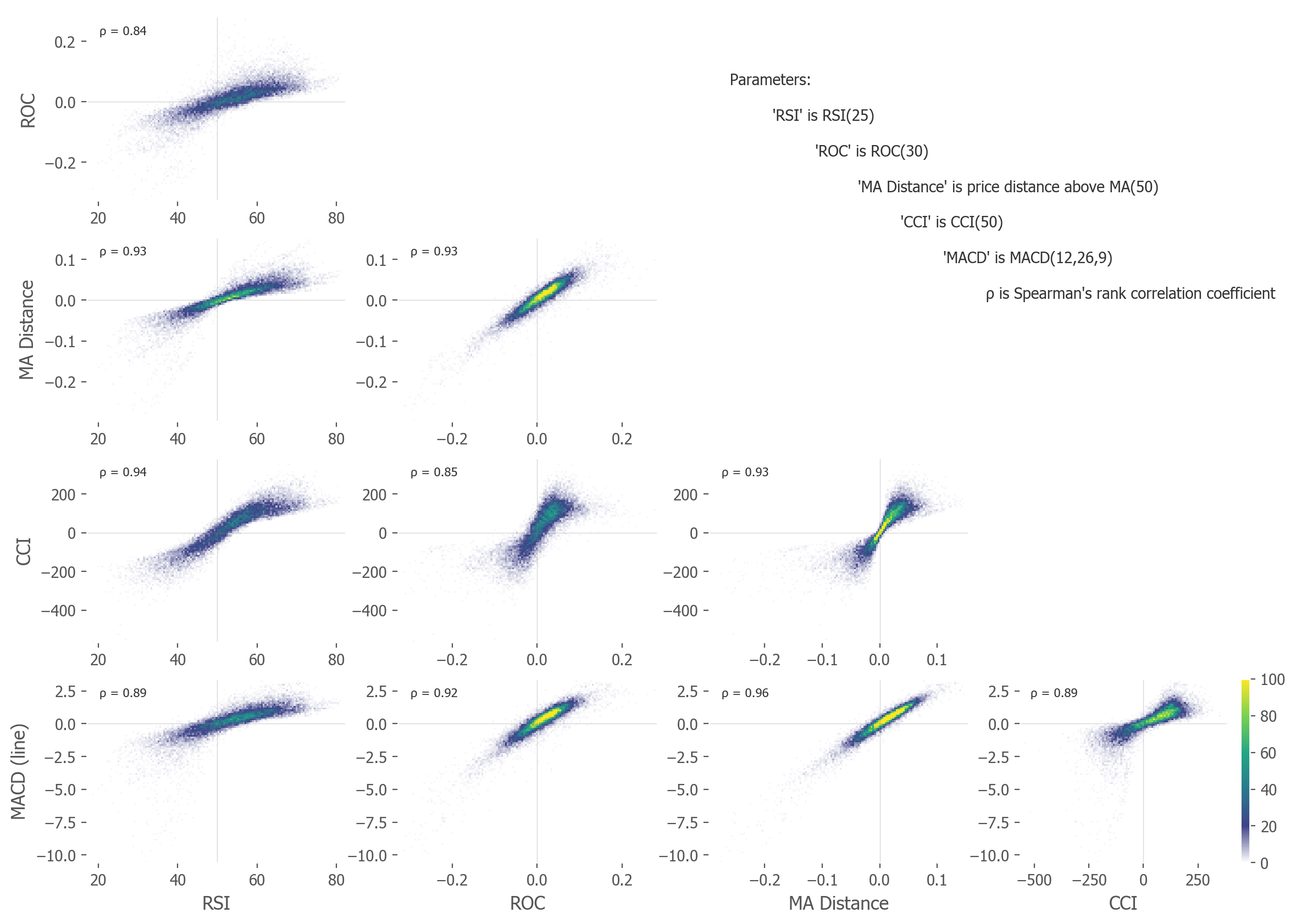
The indicators are fairly similar. They differ, of course, especially in the most extreme values. Some of these extreme values seem to be wildly blown all over the charts. But most of the values are within range and are very tightly correlated - with correlation coefficients all above 0.8, and most above 0.9. This means most of the indicator values rise and fall together. The dynamics of them are alike. Most of the time they will signal similar things.
It is clear some of these relations are highly linear (MA Distance vs ROC, MA Distance vs MACD), while other show nonlinear characteristics (CCI vs RSI). This justifies the use of Spearman's rank correlation instead of Pearson's, as the former is high between most indicators.
| RSI | ROC | MA Distance | CCI | Stochastic | %b | MACD (line) |
MACD (signal) |
MACD (histogram) |
|
|---|---|---|---|---|---|---|---|---|---|
| RSI | 1 | ||||||||
| ROC | .84 | 1 | |||||||
| MA Distance | .93 | .93 | 1 | ||||||
| CCI | .94 | .85 | .93 | 1 | |||||
| Stochastic | .93 | .84 | .92 | .94 | 1 | ||||
| %b | .95 | .86 | .93 | .99 | .96 | 1 | |||
| MACD (line) | .89 | .92 | .96 | .89 | .86 | .88 | 1 | ||
| MACD (signal) | .89 | .88 | .88 | .78 | .77 | .78 | .94 | 1 | |
| MACD (histogram) | .40 | .26 | .37 | .49 | .43 | .48 | .32 | .04 | 1 |
| Average | .85 | .80 | .86 | .85 | .83 | .85 | .83 | .75 | .35 |
A note on parameters
In the plots above, I've used the MA Distance of 50 -- the current price vs the simple moving average over the latest 50 trading days. The RSI is of 25 trading days. The ROC is over 30 trading days. CCI is 50 days, %b is 50 days and 2 standard deviations, MACD is a typical mix of 12, 26 and 9 days for the fast, slow EMA and smoothing parameter (difference of fast vs slow Exponential Moving Averages).
Why such parameters?
It took a bit of luck and datamining -- Figure 2 shows an example of such a grid search of Spearman's correlation coefficients of each indicator with fixed parameters versus different MA Distances, as they rise and decay over subsequent periods of trading days. The parameters I've chosen for the plot in Figure 1 are fairly close to the best fits of parameter values for the MA Distance of 50.
Of course, such data mining is a dangerous practice in strategy discovery and formation (risks overfitting of the resulting strategy, and as López de Prado shows,[4] necessitates a strong rerating of the confidence intervals), so try to avoid it when constructing a trading strategy. Conversely, it is acceptable for purely research analysis of existing variables, as we are exercising here.
Why the 50-day?
No particular reason, I just happen to like this time scale. Intuitively it's a fine time period for trading -- as I find the 20-day periods too short and the 200-day averages too slow (too long) for my liking. The 50-day MA just fits my preferred intuitive trading time scale best. But there's nothing special or magical about the number -- it could just as well be a 49-day MA, a 55-day, or anything between 30 and 60. Just not shorter and not much longer than this range, as different effects come into play in these different time scales. Again - this is purely my trading intuition.
We can reverse this fitting process, and instead of asking "which indicator parameters fit best to our MA Distance of 50", ask "which MA Distance fits best to the most popular, default set of parameters of these technical indicators?". Those values, as well as the corresponding MA Distance of best fit (obtained by a grid search and choosing the parameter of maximum Spearman's correlation coefficient) are shown in Figure 2 and summarized in Table 2.
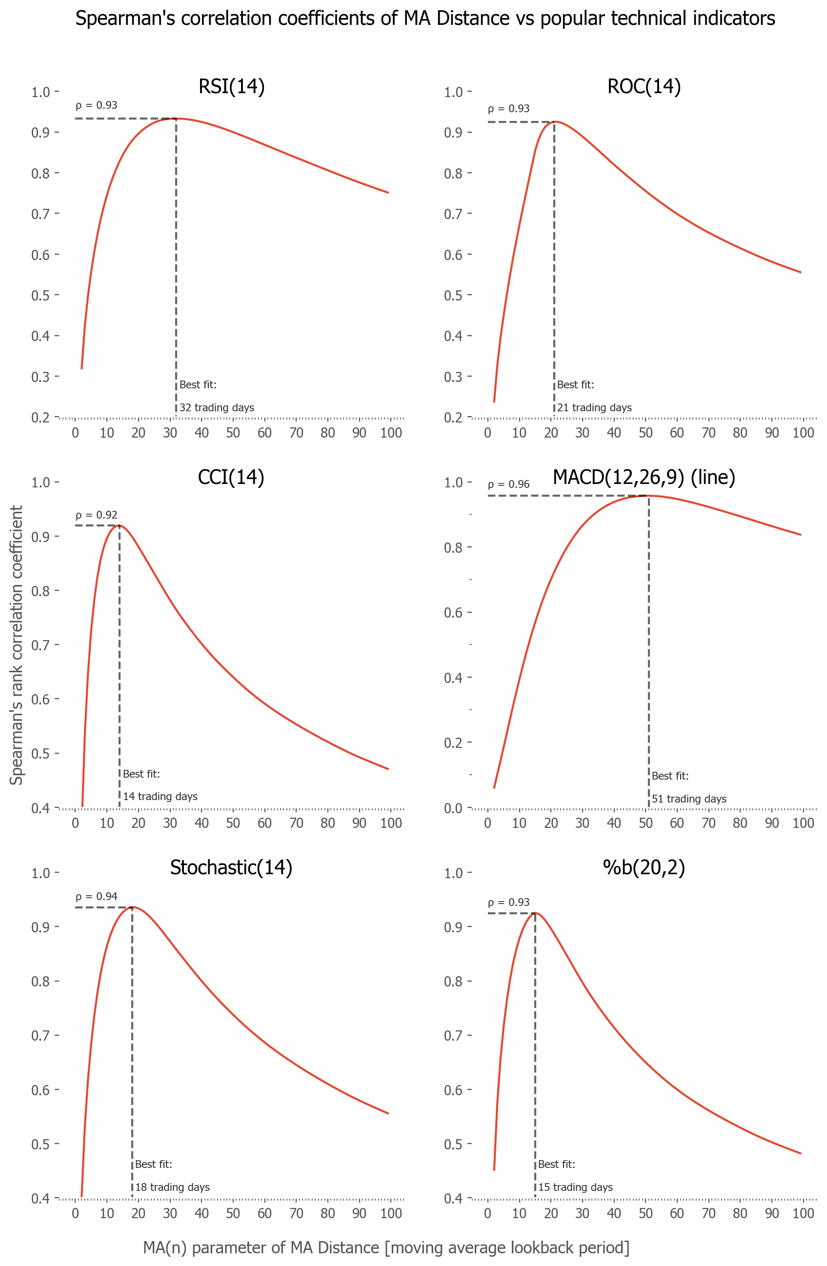
| Indicator | Default parameters | Corresponding best fit of the MA Distance indicator | Spearman's correlation coefficient of best fit with indicator |
|---|---|---|---|
| Relative Strength Indicator | RSI(14) | Price distance from MA(32) | .93 |
| Rate of Change | ROC(14) | Price distance from MA(21) | .93 |
| Commodity Channel Index | CCI(14) | Price distance from MA(14) | .92 |
| Moving Average Convergence/Divergence | MACD(12,26,9) | Price distance from MA(51) | .96 |
| Stochastic oscillator | Stoch(14,1,3) | Price distance from MA(18) | .94 |
| percent b | %b(20,2,2) | Price distance from MA(15) | .93 |
This last result might be the most practical of all this study, as it shows which MA Distance to use in order to most accurately substitute the given popular technical indicator.
How this all relates to velocity
We can think of the market price as distance in a 1-dimensional world - it goes up or down. If so, the first derivative of this variable would be the velocity -- in physics this involves taking a limit over infinitesimal time scales. That is sometimes called the "instantaneous velocity",[5] and is what physicists usually mean by saying simply velocity:

Since we are dealing with discrete time, not continuous (I assume daily price data, each daily price is a separate datapoint, but the same considerations can be taken for hourly or tick price data), the smallest possible "velocity" to calculate would involve taking the difference of the two nearest prices, and dividing by 1 - the number of daily price points between those days.
Market moves on such scales are (mostly) random, so the instantaneous velocity behaves rather chaotically. You can see this effect by taking a simple ROC(2) indicator on any price chart analysis software.
What people usually do is take a moving average over a longer window -- average out those small scale fluctuations. So by subtracting such a MA from the latest price (I assume backward looking, so numerate from the end; x1 is the latest price, xn the price n-days ago), we arrive at:

where: is a price distance between i and j moments in time,
  is the average velocity between the 1st (latest) price x1 and the i+1 previous one x1.
This is exactly the numerator of the MA Distance indicator, the rapidly changing part -- without the slow-changing Normalization parameter. It is what determines when the MA Distance is above and below zero, or when it is more or less extreme.
So we arrive at a sum of average velocities, where the weight of each one rises, the farther lookback period they have. From 1/n for the latest, most recent average price (and shortest - between the current price and the previous one) to (n-1)/n for the farthest (and longest) average price. So for a MA Distance of 50, the average with the biggest weight is an average velocity over 50 days, then 49, then 48 and so on, with the lowest weight given to the most recent price change over 2 days.
Not precisely what is typically understood as velocity in science and engineering (the default instantaneous one), but a summed, weighted series of average velocities, where the longest one dominate.
As a side note - we could just simplify and calculate one average velocity over a lookback period (as an average of ROC(2) values, the rates of change between subsequent prices, or diff(2), the absolute changes), and it would be even simpler than a whole series of consecutive weighted averages summed as in the MA Distance. Such a velocity measure would still highly correlate with the MA Distance (with Spearman's correlation coefficient around 0.92) because of the weight dominance of the longest averages in the MA Distance measure.
It will also correlate highly with the other indicators. I don't want to introduce new indicators, as the zoo of indicators is large enough already, so I do not show such an additional (yet probably the most natural for a physicist) measure here. Just to keep this as simple as possible. I leave this exercise for the reader. I encourage you to make your own calculations, as you can learn the dynamics of indicators along the way, as well as double check my results.
Acceleration
At last, we arrive at the most interesting discovery: if most indicators are like a velocity, the 1st derivative or price, how about going a step further and looking at the 2nd derivative? How would that construction look like?
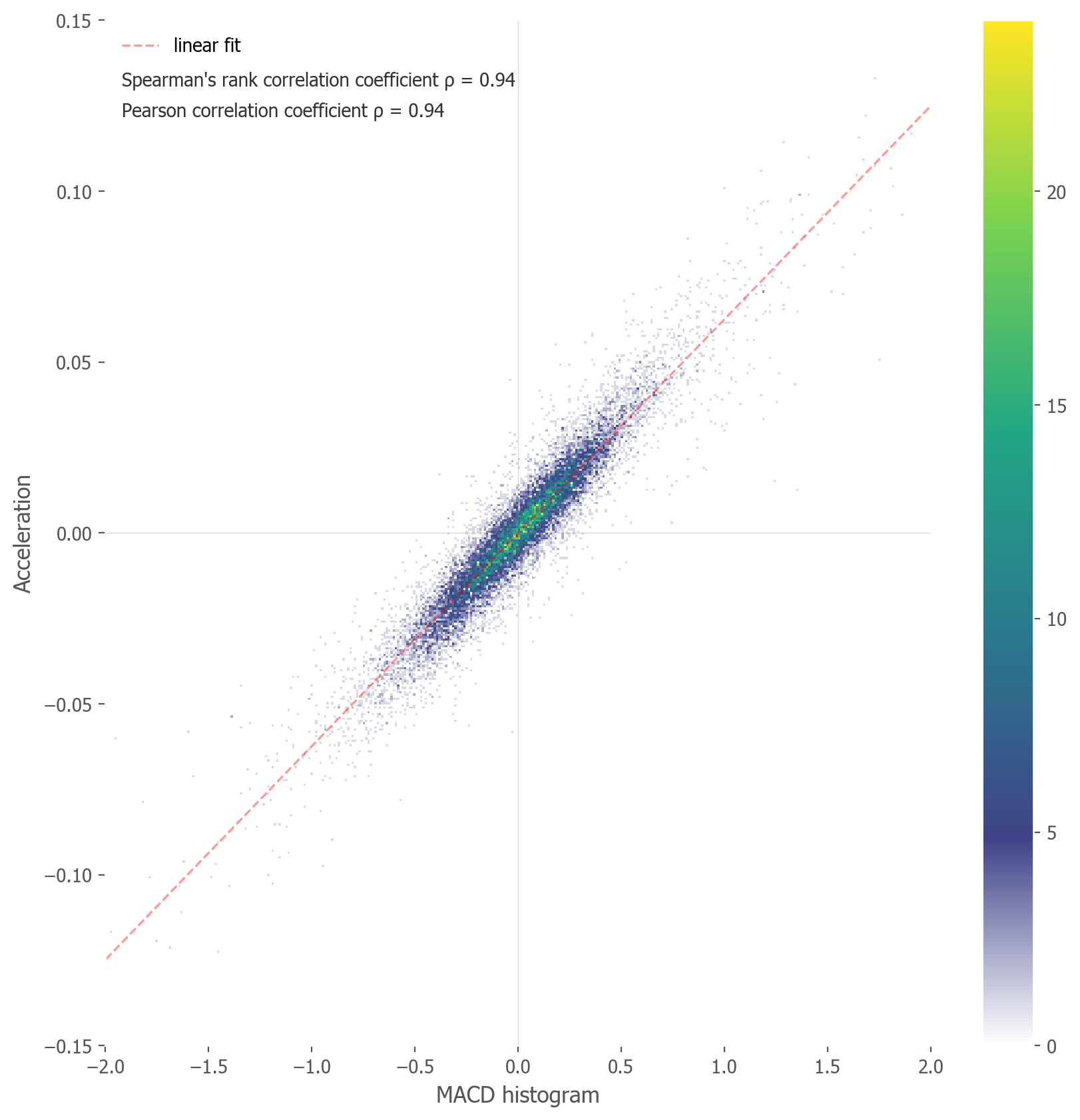
If the 1st derivative is akin to a price distance from its Moving Average, we can take this value and calculate the 2nd step: a Moving Average of MA Distance, and its distance from the MA Distance itself. A "2nd derivative". A so called "MA Distance of MA Distance". As per out analogy, I will call this variable the Acceleration for short (although, as previously seen in the velocity case, it is probably more a sum of weighted accelerations, than an instantaneous one).
![\begin{align*}\textbf{Acceleration} &= \text{MA Distance (MA Distance)} = \\&= \text{MA Distance} - \text{MA}(\text{MA Distance}) \sim \\&\sim [\text{price}-\text{MA}(\text{price})] - [\text{MA}(\text{price}-\text{MA}(\text{price}))] \sim \\&\sim 2^{\text{nd}}\frac{}{}\text{derivative of price}\end{align*}](media/indicators/Eqn-3.svg)
If you look closely at Table 1, you will notice that the last indicator, the MACD histogram, correlates a lot less to the other indicators. If you turn to its construction, you will see that is not far off from the idea of a 2nd derivative:
- the MACD line is a difference between two price moving averages (relatable to velocity as per the correlation coefficient of 0.96 with our MA Distance)
- the MACD histogram is the difference of the MACD line from it's shorter, 9-period, moving average (the 'MACD signal' line). For details please refer to the Wikipedia article on MACD construction.
So it seems the MACD histogram might be something akin to a price acceleration measure.[6] Let's put this to the test and plot a correlation scatterplot between Acceleration and the MACD histogram. This is shown in Figure 3.
As can be seen, the Spearman's correlation coefficient is a very high value of 0.94. Which suggests you can indeed think of the MACD line as an analog of velocity, while the MACD histogram (the difference between the line and signal) as an analog of acceleration.
Discussion
We've arrived at the conclusion that most technical indicators are very highly correlated amongst each other (Table 1). I've argued, that almost all (RSI, ROC, CCI, %b, Stochastic and the MACD line) are a form of price velocity, or more specifically: a weighted sum of average velocities with differing lookback periods. We've seen that the MACD histogram is most similar to a measure of price acceleration.
We've arrived at a set of parameters of equivalence (Table 2) between the indicators and a simple MA Distance - the distance of price over its moving average.
This is the basis of my claim, that almost all popular technical indicators, for most of the time, measure the same thing - and it is highly correlated to just an average velocity of the price movements.
More specifically, the correlation is greatest for the points near the middle, that is near 0 for the MA Distance, or near 50 for the bounded indicators. This suggests the momentum strategy of "being long when price is above MA" can quite reliably be replaced by other momentum strategies, such as: "being long when the RSI is above 50", or equivalently "being long when the ROC is above 0", or "being long when the MACD line is above 0". Or simply: buying when the velocity of price is above 0, the price is rising.
Of course, these are all not the same strategies and will deliver differing results. But they are highly interchangeable. The results - and the market allocations - of such strategies will be surprisingly related, especially averaged over long periods of time.
Comparably, a strategy of "shorting when the RSI is high and above 70" is very much similar to just "shorting when the price is over 5% over it's moving average". Which is to say - there is nothing magical about an RSI reading being "overbought", it's just signaling that the price has risen sharply in recent days. It shows the speed of the market (price) has been high recently. Due to the correcting, mean-reverting nature of prices in the short term, it is probable that such price movements will correct (or at least slow down).
In this sense technical indicators 'work' and are useful - as a tool for measuring how fast price is changing (velocity, 1st derivative) or even accelerating (2nd derivative). What you do with that knowledge all depends on the trading strategy you employ - as a driver reading the car's speedometer must decide what is the proper course of action in the current circumstances: press the gas pedal or push the breaks.
None of this excludes any more specific and idiosyncratic trading rules, working only on some of these indicators and not the others. One can surely come up with more sophisticated rules and find strategies that work with them. Popular approaches to the RSI strategy is not only a momentum strategy (long when the RSI is high or when just above 50) and a mean-reverting one (short when the RSI was high and starts falling), but also so called "divergencies" (when the RSI is high but not higher than recent periods, while the underlying price is still making new highs. Other more sophisticated approaches are also possible.
Yet, the above correlations suggests, that most of these strategies will be similar in nature, as the indicators themselves are. Indeed, this opens up additional possibilities - maybe technical strategies don't need the more sophisticated indicators, when simpler ones show essentially the same things.
Whatever your interpretation or explanation of this phenomenon, I find it very interesting how similar these indicators turn out to be. For me, this comprises an argument of simplicity -- why use sophisticated sensors, when the simplest one suffice? For lazy investors, like me, this might lead to using only the price and price dynamics in trading. For some creative users this may in turn lead to the creation of newer, more nuanced indicators.
A note on history
It's worth noting that most of these indicators were introduced in times long before the Personal Computer (so when calculating them in real time was a lot more work than it is today), and were invented in specific market regimes. The RSI indicator was invented by J. Welles Wilder in 1978, after the long range-bound market of the 1960s and 1970s. The Bollinger band was introduced in the 1980s. The Stochastic oscillator was conceived in the 1950s, also after a range-bound market of the 1940s. Also keep in mind, some of these indicators were invented mostly for use in the commodities markets (experiencing clearly cyclical behavior) and may or may not be so useful for other asset types.
All this is to say that maybe these indicators are just a product of survivorship bias of their era. Maybe they had much more sense in a long, frustrating range-bound market than in a clearly trending market like we've experienced lately? Maybe they will once again be more useful in ranging markets of the future?
Whatever the answer, for me one thing is certain - these indicators are some form of measuring recent average price velocity. And this price velocity may or may not have predictive features. Personally, I think it does, when coupled with the right position size and risk management tools. Intuitively, the cyclical and mean-reverting nature of the markets, especially in short time scales, gives the indicator some merit and some credibility. Conversely, the long-term trending nature necessitates a different approach than the short-time-scale one. Here one can also use them as a filter, as I've had in the Global Growth Cycle strategy. In the long road it is essential to not miss out on the most essential feature of the market, that is the compounding of interest.