2023: A Couple of New Interesting Developments Concerning the Global Growth Cycle Strategy
A couple of new and interesting developments concerning the Global Growth Cycle strategy are available:
- first of all, what I've called an important test of the strategy from 2021/22 apparently went well. The ensuing bear market of 2022 has been largely avoided by positioning per the GGC. The risk-off signal from December 2021 appeared to be perfect timing, though keep in mind that historical signals have been seen from 2 to 6 months before an important downturn, so a similar delay is to be expected in future cases. See Figure 1.
- second, another independent test of the strategy for historical data has been performed by Allocate Smartly.[1] I thank them sincerely, as this verifies part of the approach, as well as highlighting possible points of caution. A detailed discussion of vintages (different versions of the same historical data, according to differing later revisions) is available, as well as independent strategy stats (although, it is important to note, only of the model – the OECD Diffusion Index part – not the strategy involving a moving average filter). I highly recommend you pay a visit.
- lastly, one of the risks mentioned in the original article has materialized, namely: the OECD in it's recent data installment informed[2] they will no longer publish Composite Leading Index (CLI) data for all the countries available until now. That was 39 countries. They've decided to only publish data for G20 countries minus Argentina, Sauda Arabia and the EU, which amounts to only 17 countries available from now on.[3][4]
This last part is the main reason for this update. I've checked how the strategy performs on data from 17 countries only (although an important note: without historical earliest vintages, such as in the Allocate Smartly approach. Their approach is better, mine here is just a sketch and a quick calculation for a quick assessment).
A quick recap
Figure 1 shows the updated paths of the S&P500 index and the statistical average of all signals (in black) around important signal dates. On the left are the paths before and after a expansion phase ending / contraction beginning signal. As you can see, the stock index can stay 2 to 6 months in what can be called a consolidation phase after the signal point (it lags the signal), before ultimately turning down (as was the case in 2000, 2007 and 2021).
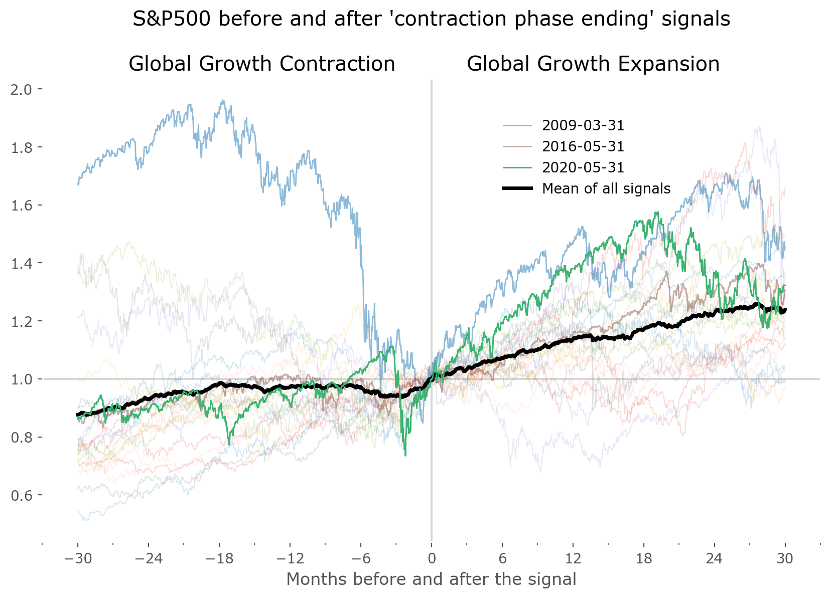
On the right hand side the paths around contraction phase ending / expansion beginning signals are shown. The index often starts to rise earlier, which usually predates (leads) 2 to 4 months before a GGC growth signal. It might be the case currently, as we'll see in Figures 4 and 5 that the Diffusion Index of OECD CLIs has just recently started to show signs of a possible upturn. Of course, nothing is guaranteed.
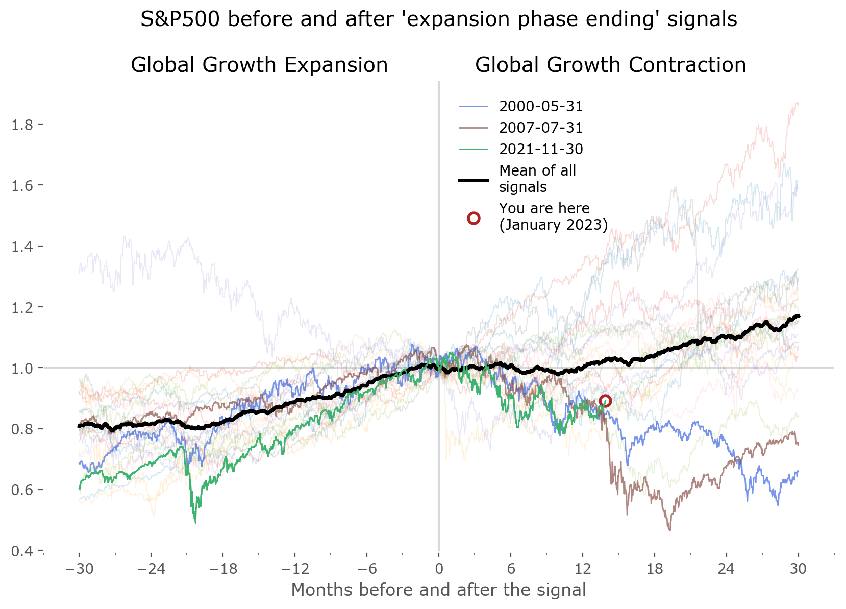
This lagging (after end-of-expansions) and leading (before end-of-contractions) of the market index is a fairly general characteristic; stock markets take time to 'slow down', so peaks are distributed in time, but they 'bottom' relatively more quickly, so the troughs are fast. This might be related to the dual notion of volatility as peaks are usually during time of lower volatility, and bottoms are usually encountered in a high-volatility environment. Two stylized facts that come to mind are Volatility Clustering and the Leverage Effect.[5]
Nevertheless, the Moving Average filter of the GGC Strategy helps to make use of this property – it doesn't ruin things when a growth phase is signaled (thankfully avoiding much of the chop experienced typically in MA strategies), but helps to more rapidly jump back into the market during a contraction phase, if the price momentum is shown to be sufficiently strong. Hence, it enters the market usually before the GGC model expansion phase beginning signal.
OECD CLIs overhaul
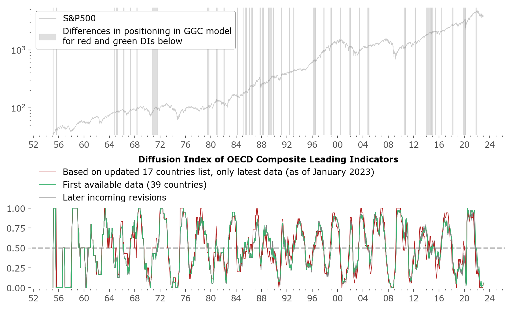
Let's move along to how the OECD's decision not to publish all 39 country CLI data might influence the strategy. At first I expected a strong influence on the results. Yet, it turns out cutting the 39 countries to just 17 didn't have that big of an effect. Figure 2 presents a couple of different Diffusion Indices: in green is the main Diffusion Index just as used in our previous works. The red line shows a DI constructed only using most recent data for the lower number of countries as they are (as of January 2023) – no previous data, just the recent file from 2023 and the historical data given there. Of course, this is not the earliest vintage, so beware – this is just for testing purposes.
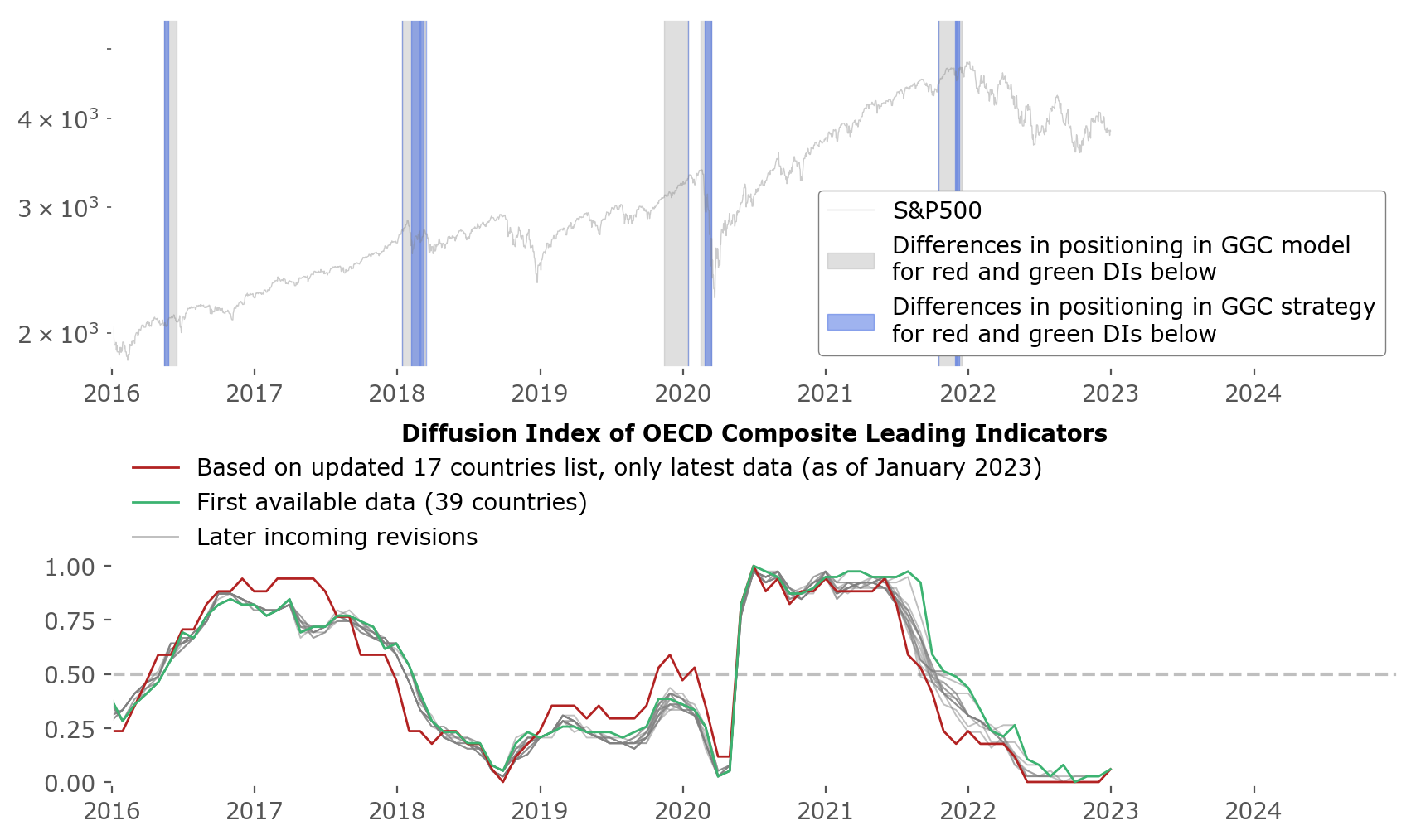
As you can see, the indices are not that different from each other. What interests us most is when they come to different conclusions, that is one is above 0.5, the other below – 0.5 being the threshold for regime switching between the 'expansion no-MA-filter phase', and the 'contraction use-MA-filtering phase'. These moments are shown in the upper chart as the gray shaded areas imposed over the S&P500 index. These are the periods with differing model signals.
Digging even deeper, one can recall that it's not the difference in the model that's most interesting for an investor using the GGC strategy, but when there's actually different position sizing in the strategy. This happens not only when there is DI < 0.5, but also when the index is below it's Moving Average. These areas of interest are shown in blue in Figure 3. As you can see – there are quite a lot of them, but a bit of zooming in on the areas reveals that most do not account to a big difference in later outcome. They occur mostly during non-turbulent times, and the small changes they entail pretty much cancel each other out. The only exception to this is the 2020 Covid pandemic downturn, as we'll see in Figures 4 and 5.
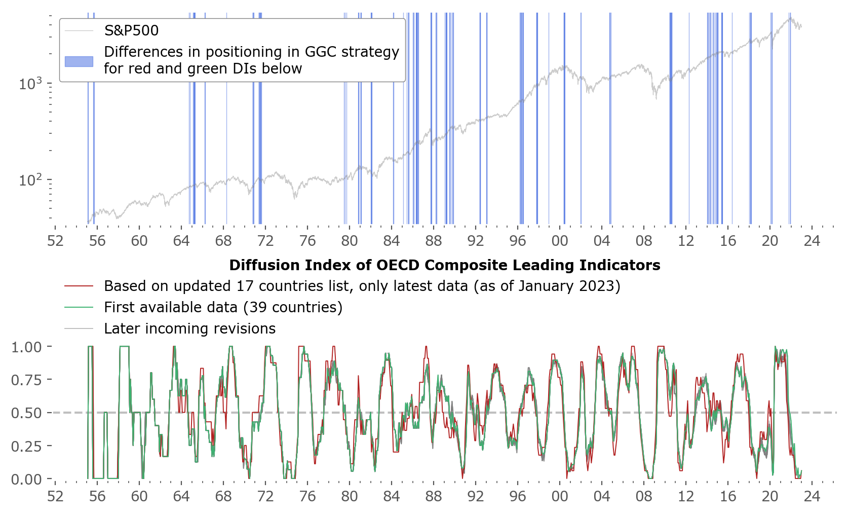
Figure 4 illustrates a zoom on the most recent years. Both the model differences (in gray) and the strategy differences of the Global Growth Cycle are shown. Also, the later data revisions (later vintages) of the data are more clearly visible here as gray lines in the lower subchart. Keep in mind - similarly as in the main article on the strategy, these signals are lagged 15 days after the "end of the month" they represent. This is done to account for the lag in publication of the data (which is usually smaller than the 15 day period, but a larger interval is taken as a margin of safety).
The most important difference of the strategy is during the late February – March 2020 volatility period. Since the red version (17 countries) issued a "risk-on, expansion phase" signal durign this time, the strategy did not escape the market during this whole period, even though the market index was well below it's MA. On the other hand the green version (39 countries) did not yet cross the 0.5 threshold, therefore was still in "risk-off, contraction phase" mode, allowing the MA filtereing rule to be utilized, and avoiding the downturn alltogether.
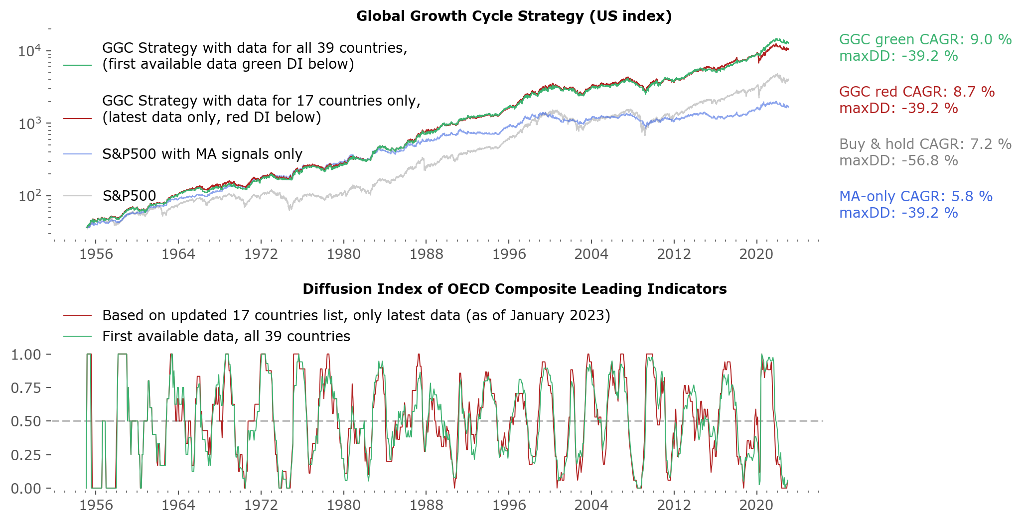
Now let's inspect the total performance differences in the strategies using the green Diffusion Index (all country data – 39 countries, earliest vintage), and the red DI (17 countries, latest vintage). The upper chart of Figure 5 shows several strategies compared: the S&P500 index (gray), a MA-only strategy (blue), this is one that does not use Diffusion Indices at all. Next in red is the strategy using the red DI, and in green the strategy for the green DI. Summary stats are given to the right of the chart: total Compound Annual Growth Rate (CAGR), and a maximum drawdown (maxDD) during the whole period. The MAR ratio, also a useful statistic of evaluation total performance and risk of a strategy, can easily be calculated by dividing the CAGR by the maxDD.
As you can see, the main difference between using 39 and 17 countries is a loss of 0.3% CAGR points, from 9.0% in the stronger version, to 8.7% in the weaker one. That is disappointing, but less than I'd expect. A quick look at the capital lines shows that they were trailing each other, and pretty much all of the difference in outcome is due to the different position during the Covid drawdown. The maximum drawdown was not affected, as the total drawdown of 2020 was not the larger one in this dataset.
Discussion
Have another look at Figure 5. Worth noting are two observations – the "MA-only" strategy, not involving OECD data, had a pretty good run until around the mid 1980s. From that point it gradually underperforms the stock market index. It would be good to know a cause for this, the quickest thing that comes to mind is an overcrowding of the strategy which might have happened with the advent and popularization of computers, charting tools, and investing in the stock market in general. Although this is just a suggestion – a more comprehensive study would be needed to check this hypothesis.
The second observation is that most (if not all) of the outperformance of the Global Growth Cycle strategy comes from the earlier years, 1955 (the start of the data) to about the late 1970s. This is a period of mostly sideways movement of the US stock market. From then on the gap between the strategy (whether the green or the red line) and the "buy & hold the index" strategy (gray line) is pretty much the same. There is not much outperformance since then. This is conceptually easy to explain in the following way: the strategy is long-only the market during expansion phases, and only switches between long-or-neutral during contraction phases. The US stock market has experienced one of the best returns among most other international markets (see countries for a short study on this topic), therefore has experienced fairly little downturns during these years – from the late 1970s it seems to be mostly up-trending, with only relatively temporary downturns along the way. This isn't as common among other developed countries. Conceptually, the GGC strategy will give the best outperformance when a stock market struggles – and that can be seen by comparing the results of the strategy vs the market index of other international markets. Please see growth: Global results.
Highlighting the two points above: the GGC offers mostly downside protection during turbulent times without as much "chopping" as is present in the MA-only strategy during expansion times. This is the main reason why the MA-only strategy struggled in recent years – it had too many whipsaws, which by using the OECD CLI Diffusion Index data we can hope to avoid in the future. Yet, the most useful features of both these strategies (GGC and MA-only) will be utilized if the market, sometime in the future, experiences a weaker decade of returns, similar to those of the 1960s and early 1970s or the 2000-2008 period. Those are conditions that would enable these type of strategies to shine brightest.
Yet, the same disclosures and objections as noted in the main article on the strategy apply. The strategy is vulnerable to data revisions. It also remains vulnerable to the changes in methodology, such as the recent OECD decision to publish new data only for 17 countries instead of 39. Although this change did not have a substantial effect on the long-term results, I suspect any additional "weakening" of the CLI database would be more damaging. OK, even data for one country can be useful for constructing some kind of market strategy. But for this specific strategy, a Diffusion Index is needed, and the less countries in it, the less useful as a measure of global synchronized economic growth it will be.
That said, the recent signal of "expansion ending" from December 2021 proved to be correct. The subsequent 2022 market conditions proved challenging – as could be expected following this strategy, which was mostly risk-off during that period. It was the first truly out-of-sample signal of the strategy, and it worked. This gives more credibility to the strategy and fuels a hope for it working as a reliable warning signal in the future.
After months of the Diffusion Index hovering around 0, a resurfacing above 0.5 again is to be expected in the coming months. We will see if this proves to be a false-positive signal, like the one in 2001 (resulting in a brief plunge below 0.5 again in 2002, five months later) or will it prove to be a reliable signal of a stronger expansion phase like in 2016. Both of these scenarios are possible, although it's hard to ignore the economic backdrop (record breaking low unemployment rate, relatively high inflation and central bank interest rates, and an inverted yield curve, all suggesting a more challenging economic landscape in the near future). The pleasant feature of automated strategies such as these is that you don't have to guess or forecast – the strategy should act accordingly to whatever market environment that arises.